Financial tools aren’t the most exciting products to use—they can feel cold, boring, and corporate. As complex tools with tons of functionality and customization, most provide insufficient training and education—and don’t even get me started on documentation.
While regulatory obligations often require that financial apps behave in a certain way, there are opportunities to make the experience fun and hassle-free for users while still keeping it professional and easy to use. With the appropriate context, financial apps can offer a pleasant and interesting user experience instead of following the drab status quo model.
With Fisdom—an investment app designed to make investing easy for people without an education in the Indian stock exchange, the client has three main goals:
- Resolve the high dropout rate that occurred before users started making investments.
- Research ways to improve the investment registration process (more on this later).
- Make the app more visually appealing—Fisdom is intended for anyone interested in investing, not just for commercial use.
Fisdom operates differently than most investment apps or services. Typically people invest in stocks, bonds, or a multitude of other things based on…well, anything! Sometimes it’s because they like the company, sometimes because they think it’ll do well, or perhaps because a financial expert recommended it.
In this app, the process is reversed. Users set an investment goal—an amount they want to accrue over a selected period of time. From there, the app suggests various options (using historical data and machine learning) and users can invest towards that goal with monthly deposits.
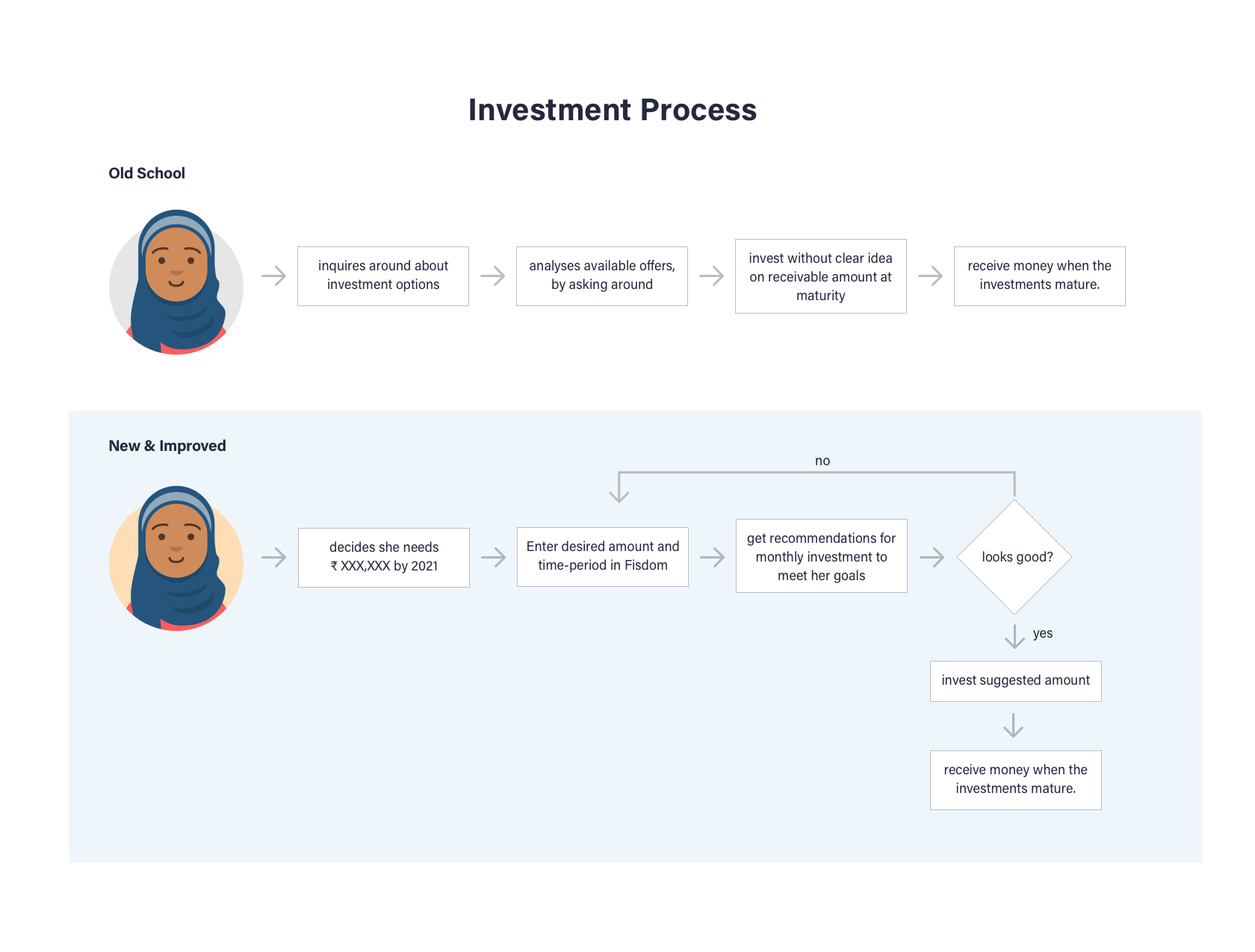
The updated process has built-in suggestions based on market heuristics and can help users with their goals more accurately.
This investing method removes the complexity of choosing individual investments (though users can still invest in whatever they’d like), which makes it critical that the app builds trust with the user every step of the way. A simple misunderstanding of even basic features could theoretically lose users a lot of money!
Yet because of the wealth of alternatives, the initiative to make the app fun and engaging had to be taken into consideration throughout the entire process. This sharpened our focus on building trust through visual appeal and ease-of-use.
Show Them the Money
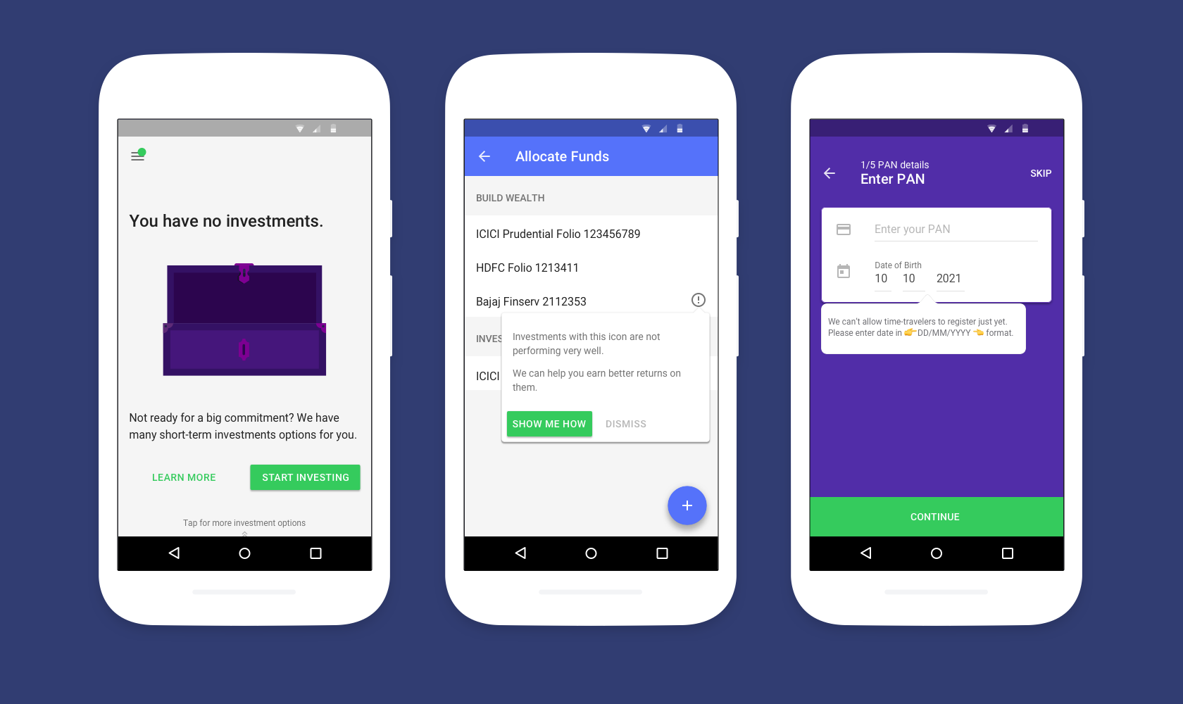
The investment process in India requires that investors complete a one-time Know Your Customer (KYC) form. The form is five pages and requires a lot of information.
Originally, the KYC was a prerequisite for users to make an investment, but in our usability testing, we found a significant dropout rate during the process. It was obvious that the KYC was too cumbersome, and the process of completing the form needed an overhaul.
So we moved the requirement for KYC registration to the end of the process.
While regulatory requirements state all investors must complete the KYC, users needed time to build trust with the app first. To establish that trust, we turned the process inside-out: Allow users to try the app, make their investment decisions, and when ready to invest, complete the KYC form. In this way, users were given the opportunity to build rapport with the app.
We even went one step further and gave three days for users to complete the KYC after making their investment decision. Their money, safe in escrow, would be refunded if the form wasn’t submitted.
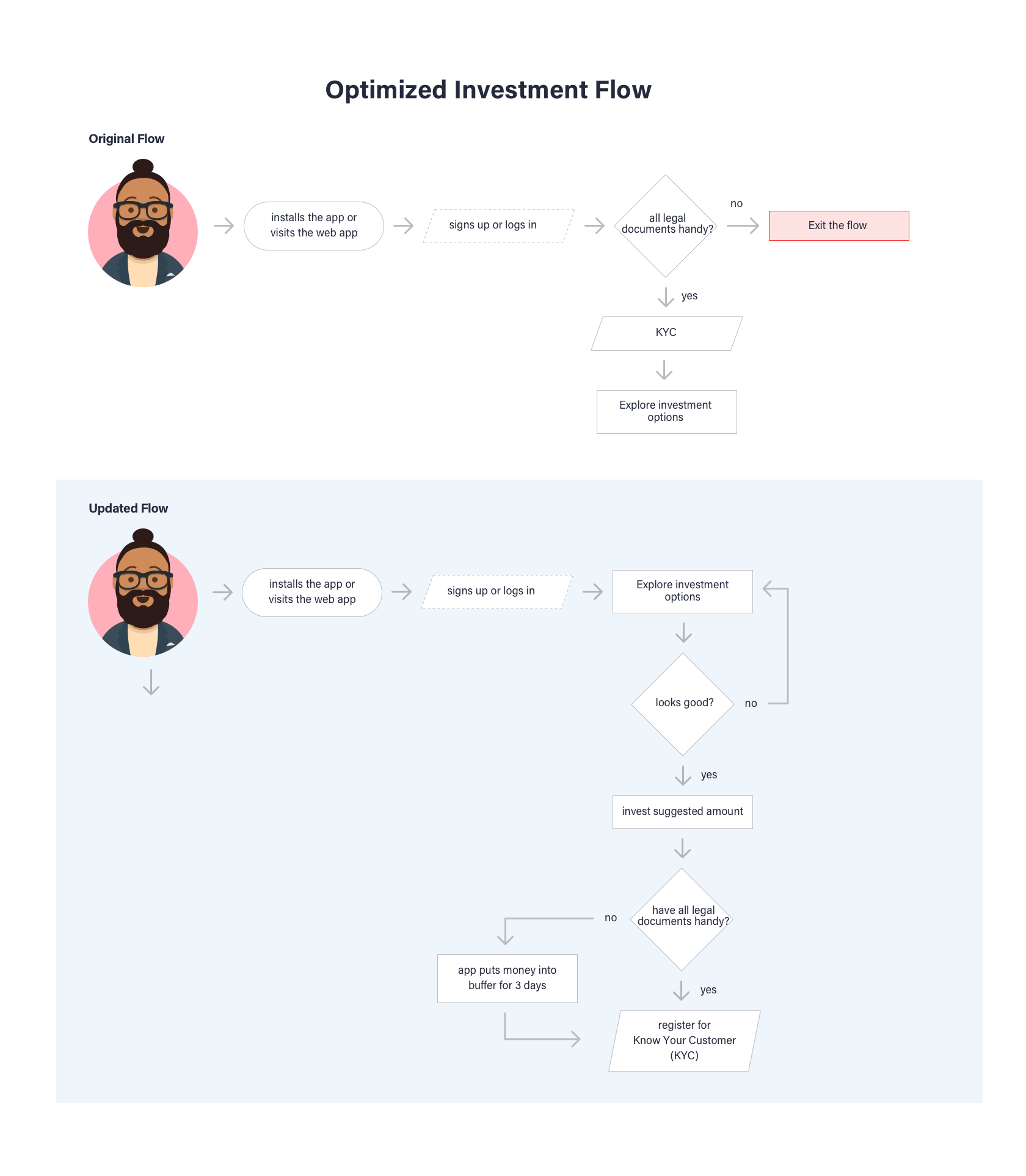
The redesigned flow minimizes unnecessary exit points and guides the users through the activity by moving cumbersome steps towards the end.
Design for Data Entry
This still left a significant challenge: Actually filling out the KYC is a ridiculous process. It’s five pages of a lot of personal information, all of which needs to be typed on the phone!
During the research phase, we found that there were a few government-approved APIs that scan for and provide essential personal information. Much of this data worked perfectly for the KYC, so users could save significant time by either scanning their tax permanent account number (PAN) card or by entering the PAN manually (all Indian citizens have a PAN).
This cut the time to enter required data into the KYC by half…at a minimum! Users who already completed the KYC were automatically 95% complete and only needed to confirm their information and provide a digital signature.
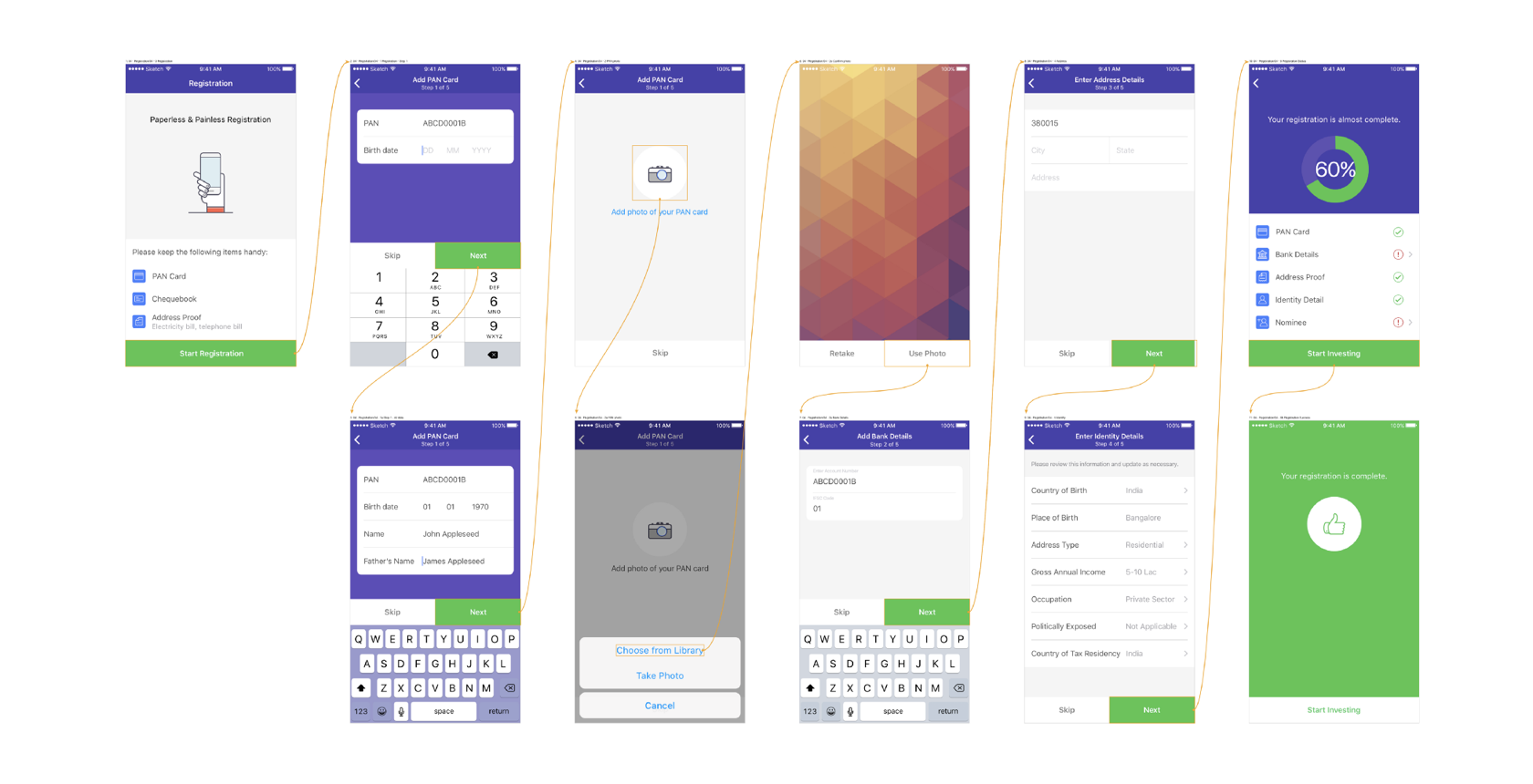
The app breaks the process of gathering all the essential information into bite-sized, distinct steps—making the system smooth and simple.
Users who didn’t complete the KYC still had to provide their essential information, so it was important to make input easy and fast. This included simple usability tricks like showing the number pad keyboard for number-only entry fields, using the camera to scan documents or cards where available, etc.
Fintech Apps Don’t Have to Be Boring
During the competitive analysis of other apps in the fintech space, it was clear most of them had bland color palettes and uninviting experiences.
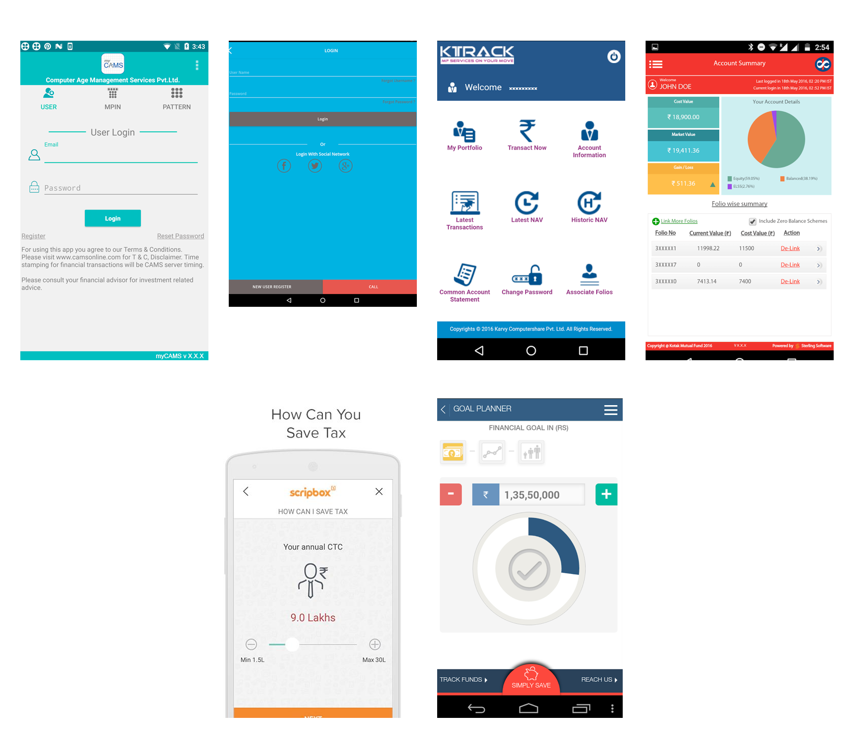
Competitor analysis—apps in the fintech sector targeting the Indian audience lack polish and do not provide the inviting experience expected by the younger user base.
When learning anything new, being bombarded with information can be overwhelming, which makes most users leave before they begin. Minimalism in design is not about flat color palettes and non-skeuomorphic buttons—although often that helps—it’s about how information is structured and the cognitive load required to use the given features.
Investing is hard enough, so we made a conscious effort to keep things simple, both for process and interaction. Subsequently, the visual design turned out wildly different compared to other fintech tools.
“Investing” in the Visuals
We did so by creating a palette that sported bright hues to support the light and playful concept of the application.

Choosing a strong color scheme helped lay the foundation for the use of images for visualizing various investment strategies (illustrations courtesy of Freepik).
Vivid graphics and illustrations enhance the experience, which is important in order to make a dry subject like investing more exciting. This is especially challenging for an investing app, not only because the content needs to be open and easy to understand, but also engaging to promote usage.
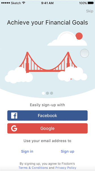
The onboarding wizard provides a clear message: This app is a simple, fun investment app to help you achieve your financial goals.
From the get-go, it was important to set a playful tone—colorful sign-up screens convey a distinct personality and small transition animations help increase engagement. This level of customer experience was uncommon for the client, so we delivered detailed animations as specs to the development team so they could better understand our design strategy and how they should implement our designs.
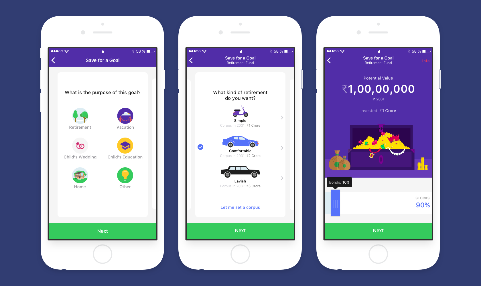
By providing visual associations with goals and clear financial targets, users can understand and see the expected outcome of their investment.
Investing long-term is daunting, and few of us know exactly where we want to be financially (aside from “I want to be rich”). To help simplify the process, we added visual associations to all financial goals. This made the choice easier to understand.
As a side benefit, visualizations also provide a way for users to learn about those options and make better-informed decisions for investing their money.
Respect Your User’s Level of Expertise
One overarching goal was to provide any user—regardless of experience—all of the information necessary to make wise investment decisions. The client’s concern was that a significant percentage of users would use Fisdom to make their first-ever investment, so it was critical to educate first-timers about the process without making the experience “too novice” for everyone else.

Users can filter content based on their lifestyle or level of expertise.
At nearly every step of the investing process, we provided heavily-curated content in the form of tooltips that users could see or skip. The knowledge base was organized to reflect various user personas (student, married, retired, homemaker, etc.) and levels of expertise. This way, users could read up on anything they didn’t understand and skip everything else.
Blank States, Language, Messages
Investing is challenging enough, so we focused on clear labeling to indicate when and where users were required to provide input or move forward. For any blank states (zero-data screens), we provided clear call-to-action buttons so users were sure about the next step.
With the app’s contextual tooltips, content was written to be fun yet direct. We tried to avoid the potential of users getting stuck because they were confused about the next step. This wasn’t just for clarity and keeping the app light-hearted; it was specifically to make sure users always had a path forward in order to complete a task, or go back, or read more about the feature.
Friendly error messages, highlighted calls to action, and helpful hints simplify complex processes without getting in the way.
Multi-step processes were also made apparent by indicating progress with steps remaining, options to skip (when possible), and clearly showing a redirect, as seen below. This creates a sense of trust in users. At every step along the way, they can see what is happening, their current progress, and what’s next.

The app’s user flow was designed with constant feedback and clear actions for users to take, guiding them along which creates trust in the app.
Closing Thoughts
Financial apps are seemingly at a disadvantage because of regulatory and legal requirements. Until recently, this has led to poorly designed, bland, and sometimes incoherent apps, features, and processes. However, in UX, these limitations can be a blessing and provide a structure for designers to work with. With a small amount of extra effort and thought, creating clear and simple experiences is actually made easier when requirements like regulations need to be followed.
This is where the new-age fintech products have an opportunity to score. By identifying their users and tailoring the experience towards a niche, the legal restrictions and requirements are a challenge to design for rather than a problem to circumvent. Those requirements also provide an opportunity to educate within the product in a fun and informative way.
With Fisdom and several other apps like Wealthy and Sqrrl, fintech apps in India are improving thanks to a user-centered design approach. Most still lack the clean interface design and refined user experiences that have become commonplace in other types of apps, but the change has already begun, and more apps and services are creating better defined, smarter experiences that address user needs.
In the Indian market, this design shift was risky; Fisdom was one of the first stylized personal finance tools, and other companies have only recently begun focusing on UX. Those risks paid off; the Fisdom app now has hundreds of thousands of installs (up from 1-5k pre-redesign) and a 4.2-star rating on the Google Play store.