In short, the best landing pages are persuasive and poignant. They are designed to beautifully communicate a brand’s value and call to action (CTA) while also increasing conversion rates and consumer engagement.
32 landing page designs from popular brands
Here’s a list of 32 landing page designs to spark some inspiration:
1. Medium’s About page
Medium’s About landing page is the perfect example of a landing page that’s simplistic yet filled to the brim with information for the inquisitive visitor.
They tell a story. With a play on typography and copy as its central design motif, Medium tells a story of inspiration and the celebration of curiosity from the top of the page down to the final fold on the bottom of the page.
Medium manages to carefully craft a landing page that is imaginatively on the nose and visually sound. It explicitly states their call to action and value on just about every header. And they do so in a manner that is incredibly alluring to their target audience of readers, writers, thought leaders, journalists — the self-proclaimed “curious minds” as a whole.
Medium knows how to communicate and sell their brand, messaging, and value proposition to their audience.
By the time a visitor reaches the final fold, that Get Started call to action is all the more appealing. Oh, did we mention, this landing page was made in Webflow!
2. DoorDash’s Dasher sign up
Sometimes, the key to designing a great landing page is the execution of the messaging. DoorDash’s Dasher sign up page is a testament to this notion. It’s designed to secure high conversion rates.
DoorDash expertly executes the standard page design for service providers. But don’t be misguided by thinking it’s merely an onboarding page. Rather, look at the content on the page.
A visitor is greeted with a call to action and sign up field, which guides them to register and get started dashing for DoorDash.
Visitors seeking more information on the brand before signing up can keep scrolling to a section that explains what DoorDash is, followed by a section that explains why you should work for DoorDash.
As the visitor continues on scrolling, they’ll find DoorDash’s detailed “How to dash” section and an FAQ in the final fold, further hammering in the brand’s credibility by thoroughly explaining the whole process to visitors. This landing page does an excellent job of persuading visitors to work with DoorDash and answering any questions they may have.
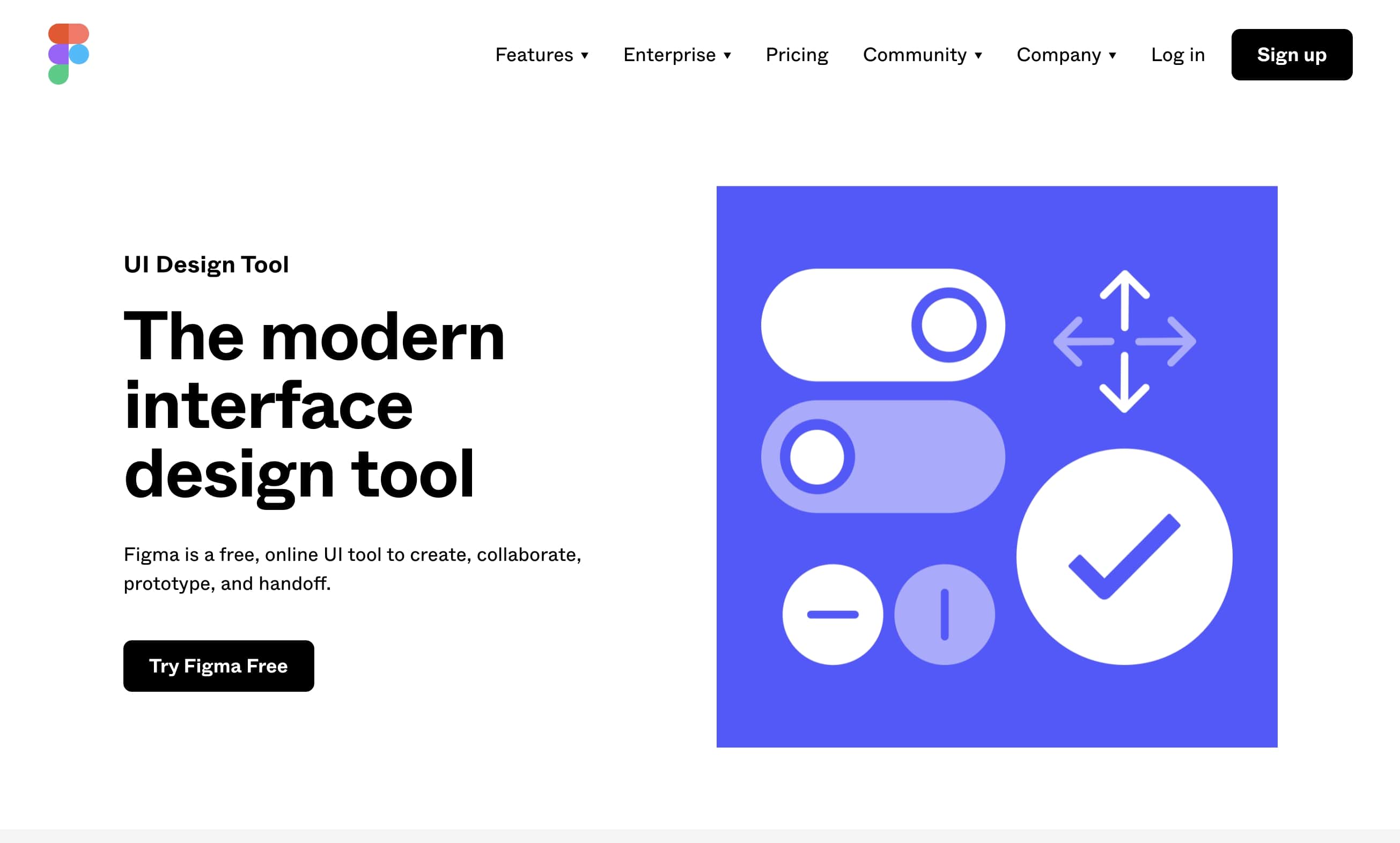
3. Figma’s UI landing page
Figma has become one of the most preferred UI design platforms among the user experience community — and for good reason.
Just by looking at Figma’s UI landing page, a visitor sees the platform’s what, value, and call to action immediately on the initial fold. That’s an impressive feat (and one that’s often overlooked).
Similar to DoorDash, Figma follows the traditional design of great landing pages. Figma starts with a hard-hitting introductory fold and follows it up with fields that demonstrate their value, their what, their why, and their how. They conclude with a list of major brands that use their platform, thus solidifying their credibility in the visitor’s mind in just a page. Credibility is huge for onboarding new clientele.
Perhaps this sharp design has helped them become one of the top UX/UI design platforms on the market. If it’s not the design, then it’s the choice signup CTA button that hovers over the landing page throughout the entire scroll.
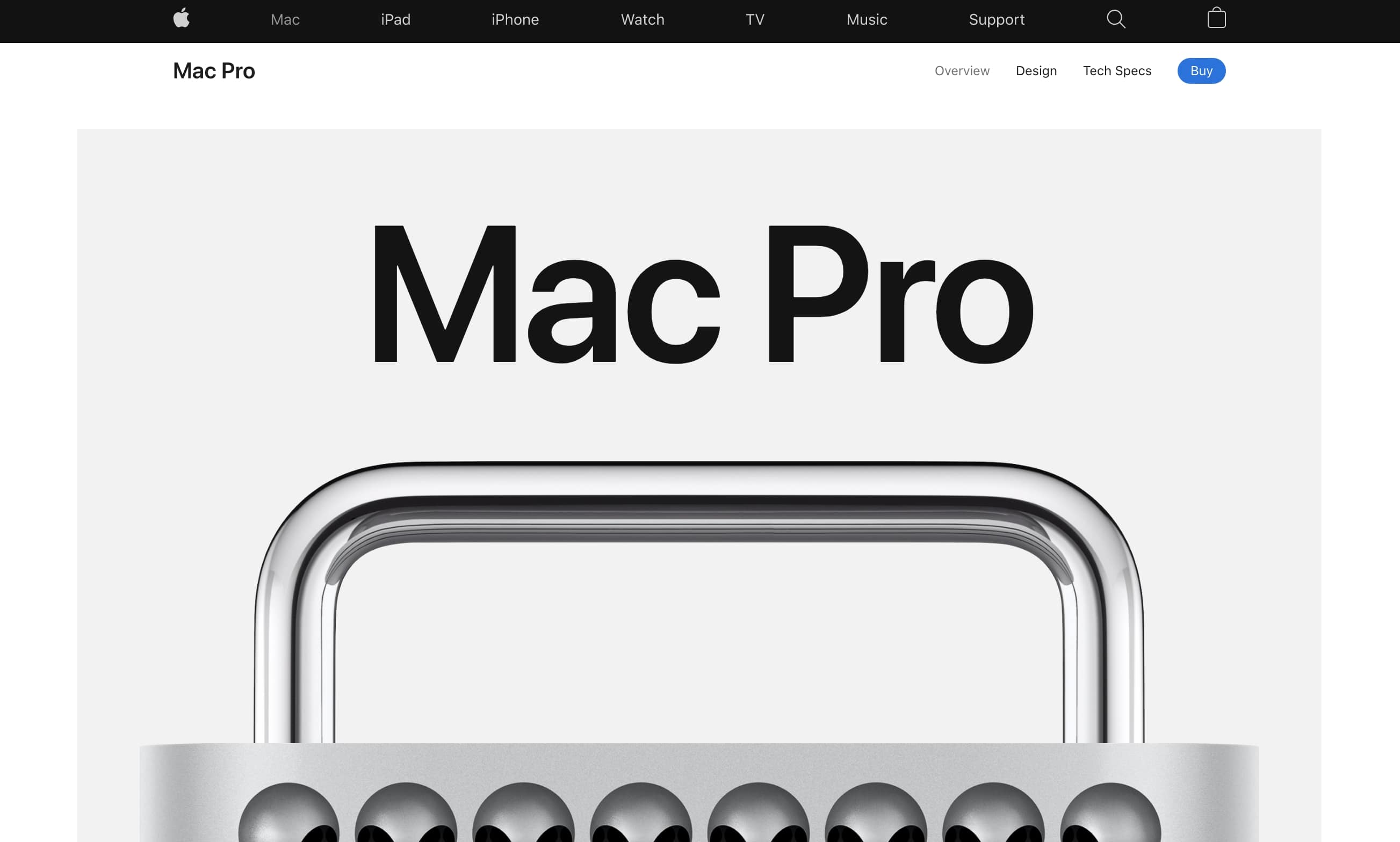
4. Apple’s Mac Pro landing page
Apple leads the tech industry in superior marketing and aesthetic use of white space in their branding. This is evident in their landing page design for the Mac Pro.
The power is in the scroll and its interactive capabilities when used effectively. The landing page tells a story, unveiling each paragraph with a flick of a finger.
Yet this particular landing page isn’t designed for a typical Apple consumer, and it differs slightly from their other web pages. The company is well aware of their target audience for this product: creative professionals — think photographers, videographers, film and photo editors — in need of a device suited for processing massive amounts of raw footage and data. Apple combines their traditional aesthetic with a sleek appeal of professionality and technical prestige to better speak to their target audience.
Apple begins their narrative in their traditionally minimalist fashion and sprinkles all the relevant information concerning specifications of their latest technology throughout the rest of the page.
At the bottom of the page, Apple concludes with an especially niche CTA, prompting the visitor to explore the Mac Pro in augmented reality, among other things, allowing those fields to serve a lead generation purpose.
5. ShareCalmly
ShareCalmly is a great example for startups and small businesses drawing a blank on their landing page design, and it’s made in Webflow!
Sometimes, the strength behind a great landing page is simply in a brand’s ability to communicate its messaging cohesively. This is where it’s crucial to know your target audience and the value they are seeking.
ShareCalmly knows its audience and designs its homepage to gradually reveal its value proposition in each fold. They conclude with a tried-and-tested “get in touch” call to action at the bottom of the page. This works in their favor as they have effectively shared their product’s value, functionality, features, and pricing throughout the rest of the page.
ShareCalmly has managed to eliminate any lingering confusion for the visitor, and thus, the final prompt to get in touch is fitting.
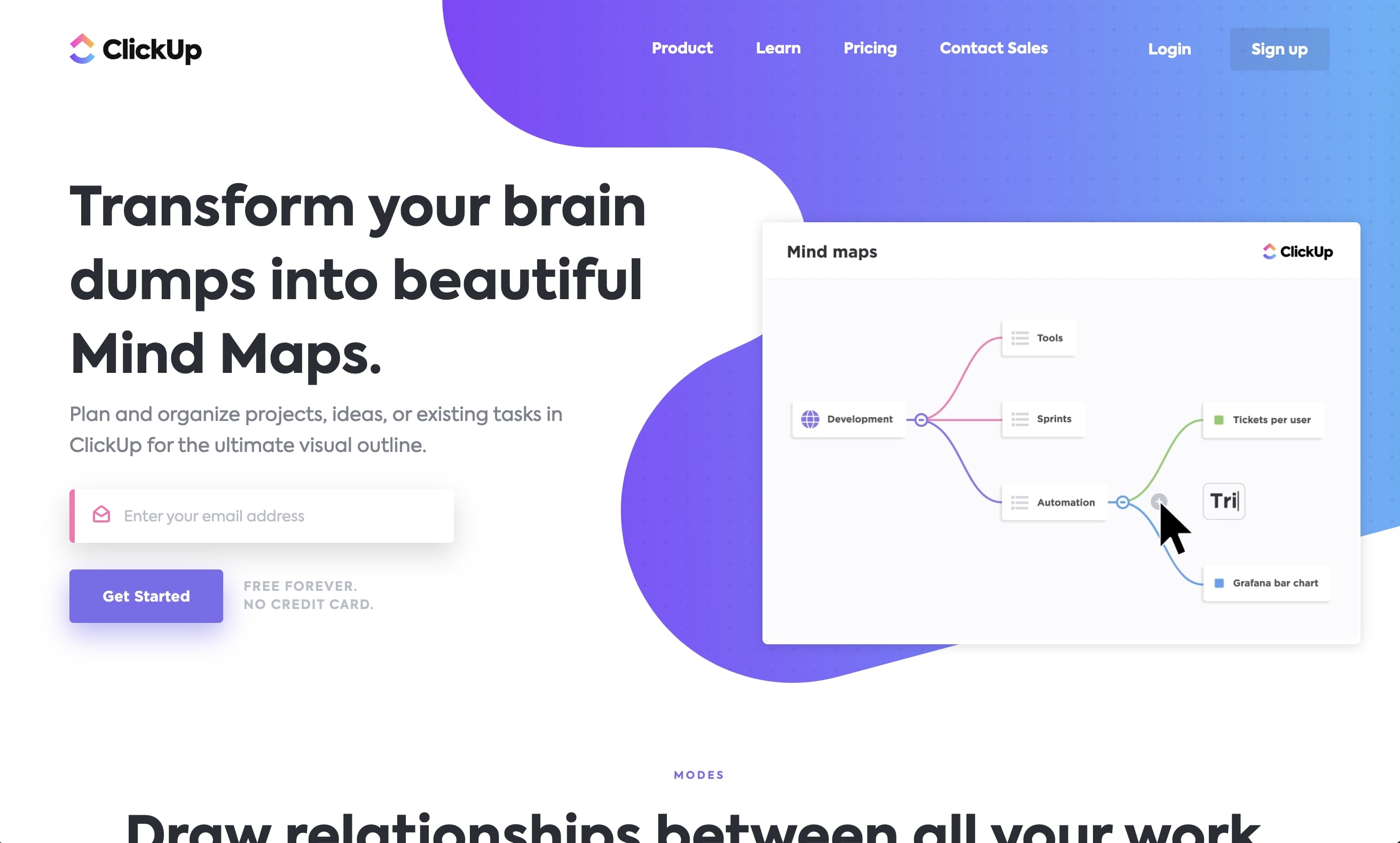
6. ClickUp’s Mind Maps
ClickUp’s Mind Maps landing page is another great landing page example to serve as inspiration for SaaS businesses or startups in the tech sector. They too follow a traditional layout often used in landing page designs — if it’s proven to work, why not!
However, what makes ClickUp’s landing page design stand out among others is how it incorporates the brand identity throughout the page. You’re completely immersed in their design, particularly their product visuals and candy-like color scheme.
A CTA email opt-in form field at the bottom of the page is a fitting conclusion for a page that opens with the same email opt-in form field.
7. Miro
Another SaaS landing page design that can serve as a great template to draw inspiration from is Miro’s landing page for their online brainstorming tool.
Similar to ClickUp, Miro uses an opening hero image and subsequent graphics to visually communicate and display their product’s value to their target audience. However, Miro takes this concept and runs with it, incorporating mesmeric motion graphics to visually demonstrate the functionality of their products in each fold.
They weave in a testimonial to reaffirm their credibility and a registration opt-in before concluding with a call-to-action prompt for the visitor to discover more of their brand’s value and product’s capabilities.
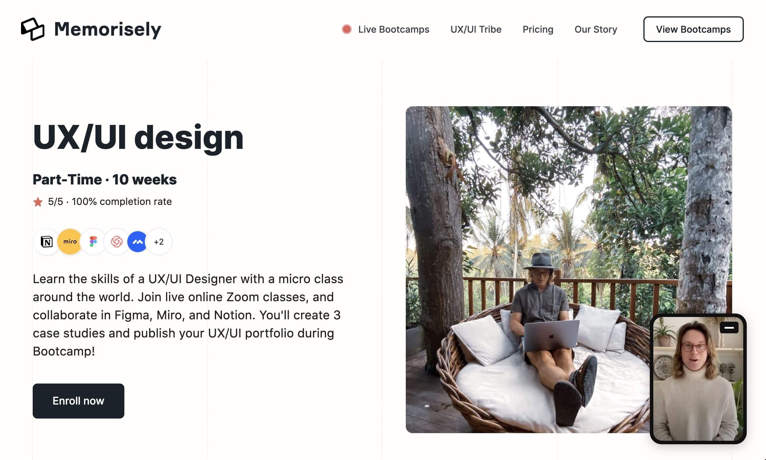
8. Memorisely
Online learning skyrocketed in 2020. Some platforms mastered the art of streamlining this virtual experience, and some still are working out the kinks. This particular platform falls in the former category, scaling their reach perhaps due to their effective landing page!
Memorisely’s landing page features minimal, copy-driven design that eliminates the noise and serves up only the necessary — what, why, how, and testimonials.
A static sidebar menu outlines the course’s curriculum with a Enroll Now CTA button as the visitor scrolls throughout the web page — a genius addition.
Memorisely has by far one of the best landing page examples for a learning/education platform, and it’s made in Webflow!
9. Webflow’s Designer
Our Designer landing page is a great example of a landing page design. In particular, this is a great example for SaaS companies in need of a so-called designer’s push in the right direction.
Similar to Apple’s web design, we’ve incorporated the power of the scroll to unveil the Designer’s capabilities with a simple flick of the finger.
Scrolling can be an ideal way to organize the content within a web page as it immerses the visitor in the page and tells a story in the process.
We open with a call to action at the top of the page and conclude with one too, prompting the user to get started and eliminating any hesitations by putting this CTA button alongside a list of some of our most notable clientele.
And, of course, this landing page was made in Webflow.
10. Shef
Shef’s landing page is a great example particularly for small business owners seeking to create a platform to expand their reach and generate leads.
They use a similar approach in their design to DoorDash, starting with a hero image and CTA button up top, then revealing the platform’s what, why, how, various testimonials, and additional features — reaffirming the value they provide for inspired chefs and foodies alike.
Shef’s landing page concludes with an appropriate FAQ section and the same call to action from the opening of their page, tying it all together.
11. Stripe for marketplaces
Stripe’s marketplace landing page is a shockingly gorgeous web page!
Their initial fold opens with a tastefully designed motion graphic, presenting the functionalities of the platform and subtly flexing their well-known clientele.
This fold is notable as it could serve as a stand-alone — it shows the visitor, at first glance, what exactly Stripe does as well as their value.
Upon scrolling, visitors see a detailed (and interactive) presentation of Stripe’s capabilities, who their target market is, and why this marketplace needs the visitors’ services, particularly ecommerce industries.
This is essentially a bullet-point presentation of a pitch and value proposition transformed into a web page, and it works in Stripe’s favor.
12. Nightwatch
Nightwatch is another fabulous landing page designed with Webflow worth noting on our list. With their peculiar graphic art and memorable brand identity, Nightwatch boldly sets itself apart from other rankings, SEO, and SERP service providers.
They follow a template of claim, support, and graphic, repeating the template down the page before concluding with questions to encourage the visitor to get started via a CTA button.
The success of Nightwatch’s landing page is through the introductory hero image of their cheeky take of an Illuminati-esque eye over a pyramid, precise copy that displays their profound skill and knowledge within this niche sector, and rhetorical approach to displaying their value to their niche market throughout their entire web page.
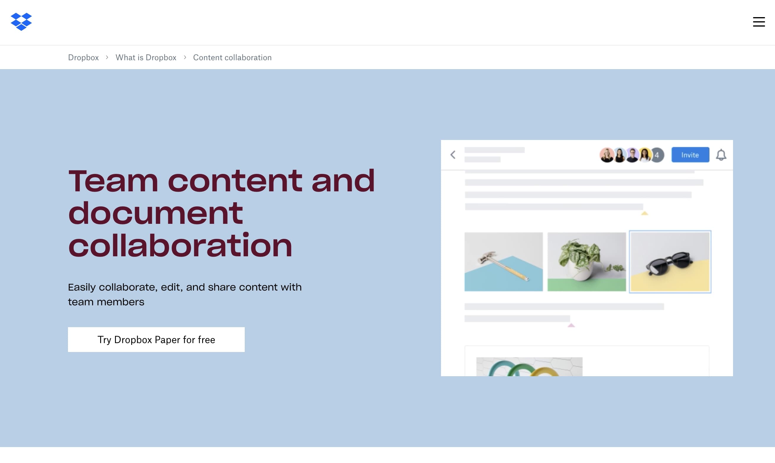
13. Dropbox content collaboration
Following a similar mold to DoorDash and Shef, Dropbox utilizes the tried-and-tested approach for their content collaboration’s landing page design.
Dropbox uses simplistic and minimal white space as its driving force to carry its design, carefully incorporating copy and imagery when necessary.
We are greeted with an aesthetic motion graphic that visually communicates the platform’s claim of collaboration, as well as a CTA button prompting the visitor to try the platform for free.
The visitor scrolls to find a quaint layout on the rest of the page that further explains the features of the Dropbox platform, as well as a choice FAQ, a lineup of additional features, and a final CTA at the bottom of the page. Sometimes, less is more.
14. Gusto benefits
Gusto’s landing page proves that sometimes it’s best to break from the mold and create a standout web page that sets your brand apart from the competition. Gusto’s landing page design is quite exciting. Their interactive design takes a mundane subject like employee benefits (no offense) and invokes a feeling of play.
While the rest of the page follows a traditional landing page design typical to SaaS providers, Gusto’s incorporation of this interactive feature at the top makes their landing page enticing and different.
A visitor is given complex information in a bite-sized chunk with the click of a button. This is what makes Gusto’s landing page work — they know their target audience and how to use interactive design to convey and validate their audience’s needs. A visitor is given the impression of full control, reaffirming that this platform is for them.
15. Wise
While we’re on the subject of interactive design, let’s talk about Wise, a platform for transferring money abroad. The information on this landing page is dense, but TransferWise includes an interactive demonstration of the functionality of their platform on the opening fold to clearly communicate what their platform can do. This is a wise choice!
Similar to Stripe, this initial fold could be a stand-alone web page as it effectively communicates the brand’s what, why, how, value, and call to action without even having to scroll further. It’s immersive.
Upon scrolling, a visitor is shown a dense demonstration that further expands on TransferWise’s introductory fold. The landing page concludes with a final “find out more” CTA button juxtaposed with images of the actual consumer base, leaving their target audience with the thought of, “Hey, that looks like me!” and persuading them to use Wise.
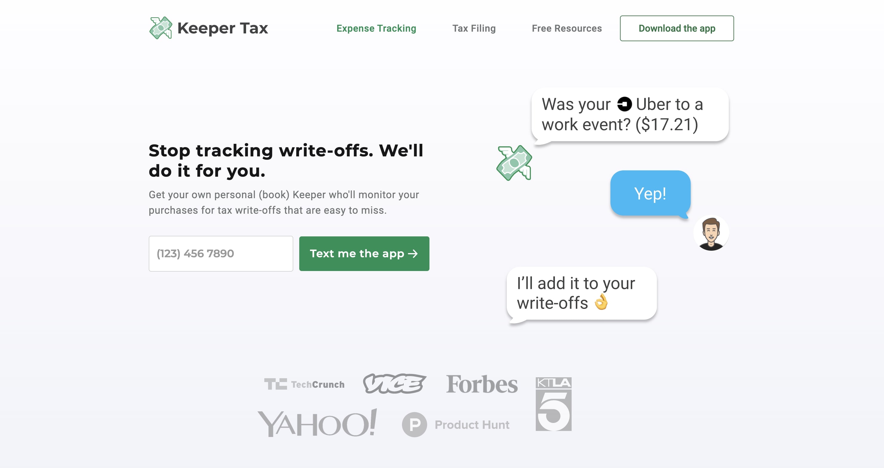
16. Keeper Tax
Keeper Tax’s landing page proves that landing page storytelling has no bounds, no matter your product, service, or brand — if you dream it, it’s feasible. You just need the right designer. (And design platform — this is also brought to you by Webflow!)
Keeper Tax’s landing page is a story within itself. At the top of the page, the visitor sees an opt-in CTA for a phone number text field and a hero image showing what happens upon opting in for the bookkeeping service. Immediately, the visitor can imagine themselves participating in Keeper Tax’s services.
Motion graphics appear as the visitor scrolls throughout the rest of the page, further detailing the features, what, why, how, and pricing. The story comes to a close with a call to action for the visitor to get started before concluding with an essential and insightful FAQ field at the bottom of the page, completely answering the visitor’s questions.
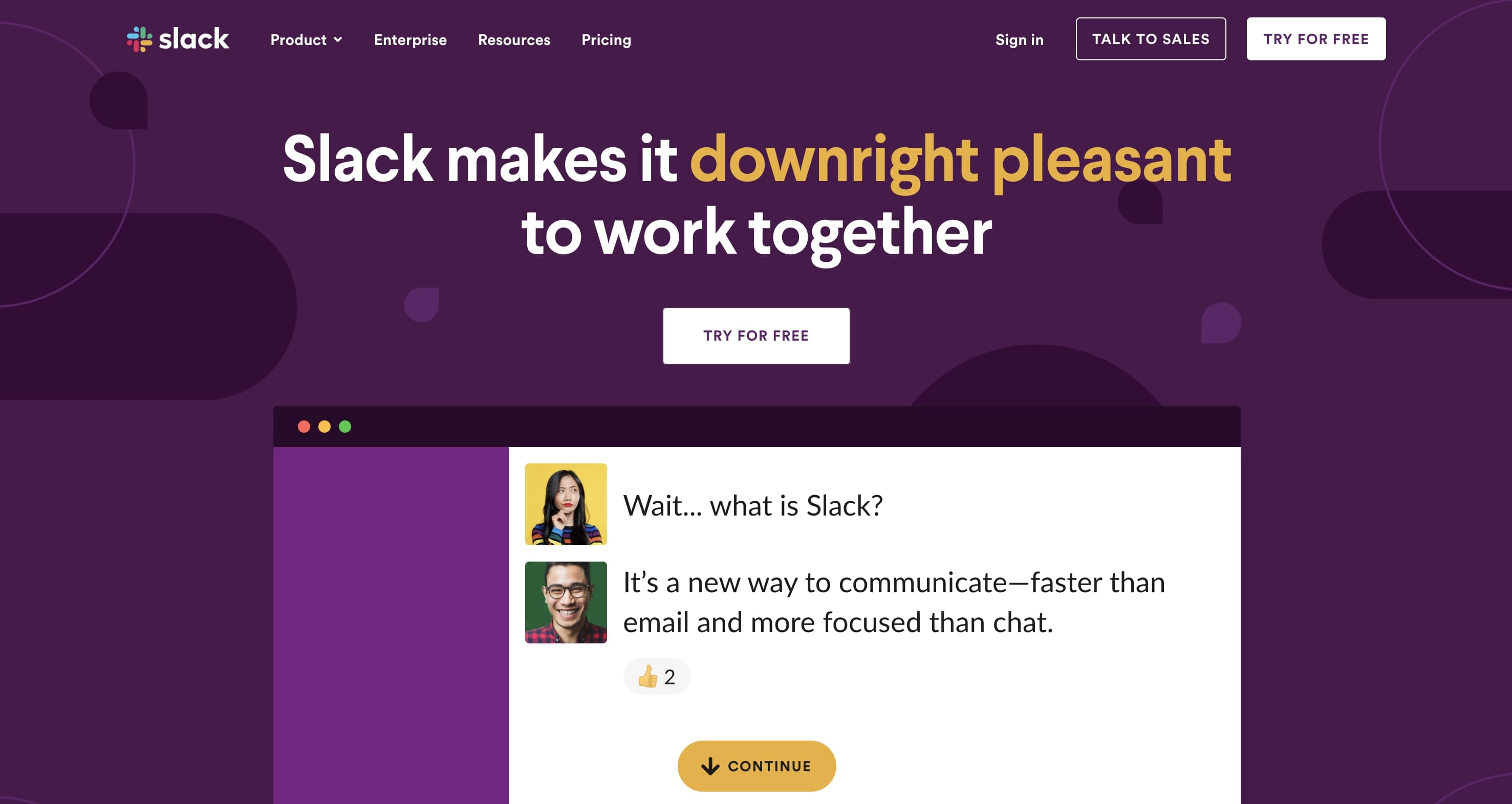
17. Slack
Unless you’ve been living under a rock, you’ve heard of and maybe even used Slack.
Slack has risen as the go-to platform for workplace communication and collaboration, being the main platform for both new and old industries. That’s impressive.
Their landing page is brief, only containing the relevant information for the visitor — what the platform is, its features, and its credentials.
We’re given introductory and concluding calls to action for the visitor to download the app — Slack is well aware that if you’re on this landing page, you’re probably just looking for that download link.
18. Drive with Uber
We’re all familiar with this car-sharing service. However, Uber’s “Drive with Uber” landing page isn’t something to overlook.
This webpage is worth noting due to a central feature: an onboarding form field to become a driver.
This page exists to onboard potential drivers. Uber displays only the relevant information on the page, optimizing the content by eliminating any potential confusion and sticking to the basics.
If you’re looking to design your own landing page to onboard new subscribers, whatever your business or service, Uber’s landing page can serve as inspiration.
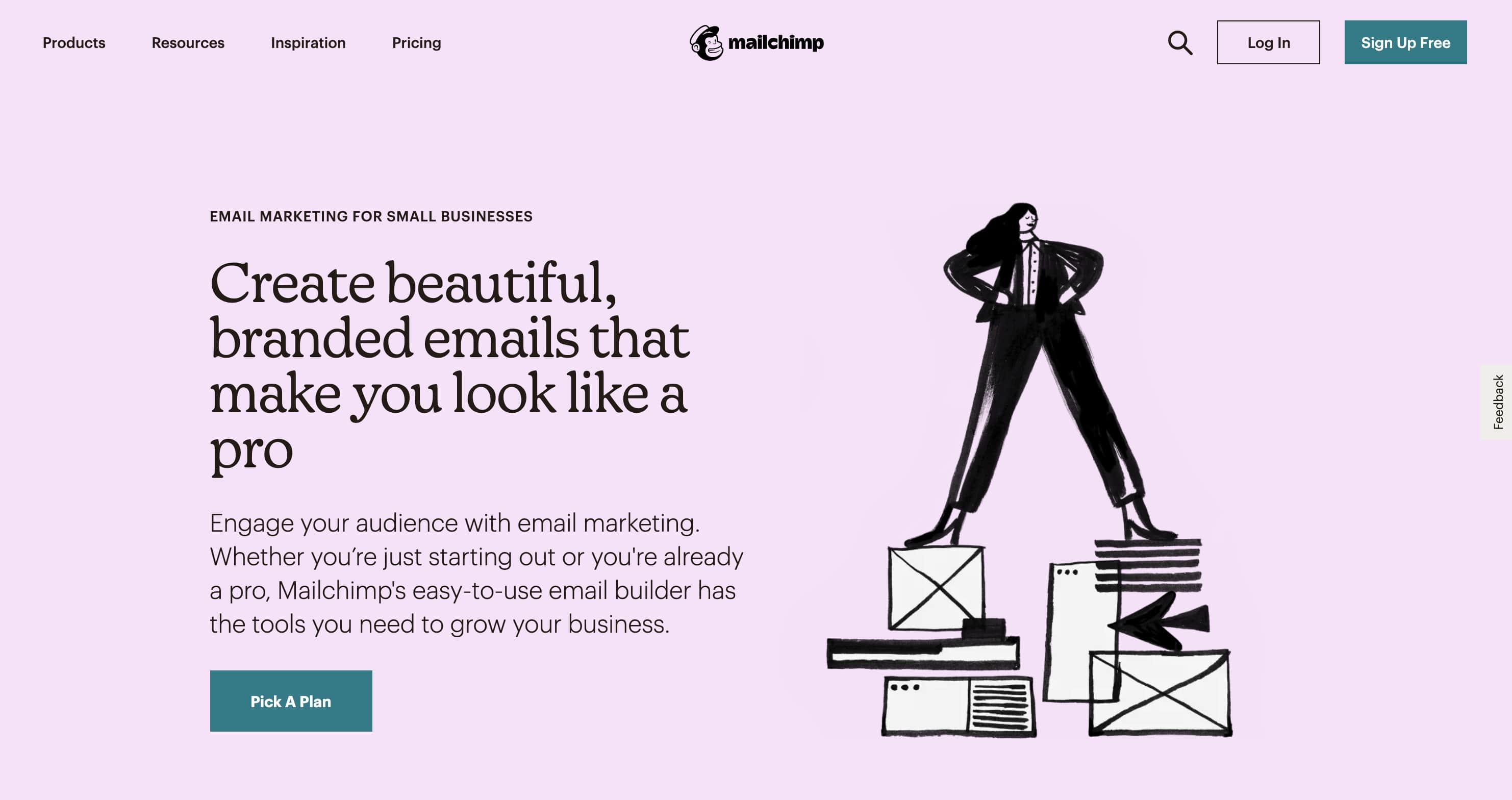
19. Mailchimp email marketing
A marketer’s must-have for email marketing, Mailchimp has aided in the growth and success of many small businesses and startups alike.
People know that Mailchimp works — and the brand is aware of this. They use their landing page as an extensive how-to guide, rather than a pitch to detail their “why.”
Mailchimp details their product’s features through charming illustrations and wireframe visuals showcasing their software’s drag-and-drop builder, marketing automation, reports and analytics, email templates, store integrations, and so on.
This landing page is extensive, to say the least, leaving no stone unturned for the visitor.
20. Airbnb host homes
Airbnb’s host landing page has made the list! They weave together beautiful images of homes and practical information about how hosting works to persuade visitors to give it a try.
From the top of the page to the bottom of the page, Airbnb showcases idyllic experiences that visitors can create for their guests through the platform.
These visuals are why this landing page works. Moreover, the placement of the chosen visuals and copy showcases the Airbnb design team’s careful consideration when designing this landing page. It’s incredible.
Airbnb concludes their landing page with a gorgeous image that invokes a sensation of wonder. Underneath this image, a call to action beckons the visitor to find out more by entering their email and/or phone number to receive additional information and gain access to Airbnb’s live webinars.
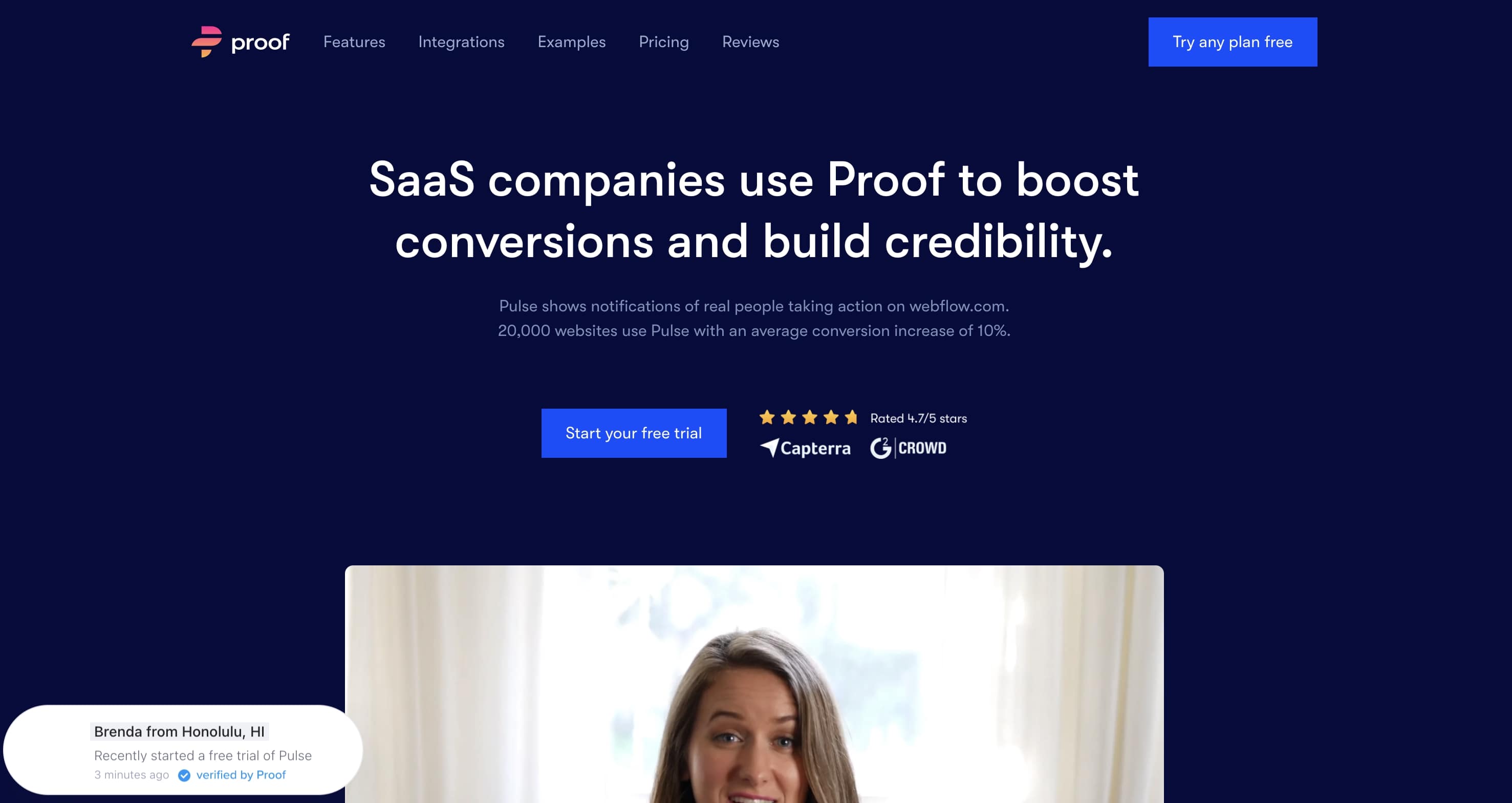
21. Proof Pulse
Proof knows their product Pulse is complex, which is why they begin their product landing page with a video hero image that clears up any confusion in the initial fold.
This is smart on their end. It gives them space to expand on the content within the video throughout the rest of the web page.
The content is dense but necessary to include on the landing page. Modern and colorful visuals showcase the platform’s interface. A comprehensive list of its features such as A/B testing, analytics, and so on, as well as support for the platform’s claim of being the number one social proof tool for SaaS companies, make up the middle of the page.
Each fold of the landing page builds on the next until its grand conclusion with appropriately placed testimonials and a call to action to get started for free. Oh, and did we mention, this landing page was made in Webflow?
22. Kajabi
At first glance, Kajabi’s landing page may seem like your typical landing page. However, if you take a second look and pay close attention to the page’s copy, and its target audience, you’ll find why this landing page works so well.
When you’re reaching out to a new market, you need to be concise in your messaging. Kajabi does this well. They’ve minimized any potential confusion by including only the essential information for their target market.
The addition of an explanatory onboarding video placed precisely beside their Start Free Trial CTA button is another subtle yet intelligent choice on their landing page design. This page was also made in Webflow!
23. Gemnote
Gemnote, another website made with Webflow, has quite an impressive landing page.
Their interactive graphic, located just below the page’s initial fold, is particularly interesting. Instead of a pop-up, Gemnote opted for a more creative take on registration.
Not only is the registration graphic creative in its design as a submission form field, but it demonstrates to the visitor how streamlined it is to start using Gemnote’s services.
The rest of the page consists of aesthetic imagery of the curated and customized products — and more importantly, the high quality of said products. The landing page is a perfect example of how to effectively entice a visitor with each flick of the finger as they continue scrolling on the web page.
24. Loom for Marketing
Loom has quickly become a favorite tool for a variety of use cases. It’s been incorporated as a marketing tool for brands such as HubSpot, Lacoste, Intercom, and so on.
You can understand how Loom has managed to secure conversion rates and lead generations so quickly by looking at their landing page.
We see a traditional approach to creating a landing page design, yet Loom’s precise messaging and layout sets this design apart.
Loom has crafted each fold to build upon the next. Starting with a solid claim, support, and CTA in their initial fold, Loom follows with the claim and support model up until their conclusion.
They conclude with a lineup of their impressive clientele, effectively conveying Loom’s value to visitors.
25. Buffer
If you offer a complex service for the average individual and you’re having trouble compelling them to use your service or product, look no further than Buffer’s Analyze landing page.
Buffer’s choice usage of colorful and wholesome illustrations is both inviting and encouraging. And so is their language, with adjectives such as gorgeous to describe their product’s dashboard.
Buffer intentionally takes a subject that is typically associated with dread — social media analytics — and reimagines it as welcoming.
This is a wonderful reference for your own landing page if you have a product or service that is possibly incomprehensible to the average individual. A landing page design like Buffer’s dispels that overwhelming sensation of dread that could be keeping your target audience from onboarding.
26. Intercom Customer Engagement
For another great example of communicating the value of a complex product or service through design, check out Intercom’s Customer Engagement landing page.
They too have mastered the art of making the complex simple. Through employing pleasantly engaging motion graphics, an email opt-in video demo, and ever so concise copy, Intercom conveys a sense of ease and agility to its target audience.
This sense of ease is vital for increasing your conversion rates and generating new leads. People are more likely to invest in a new product or service when they actually understand said product or service.
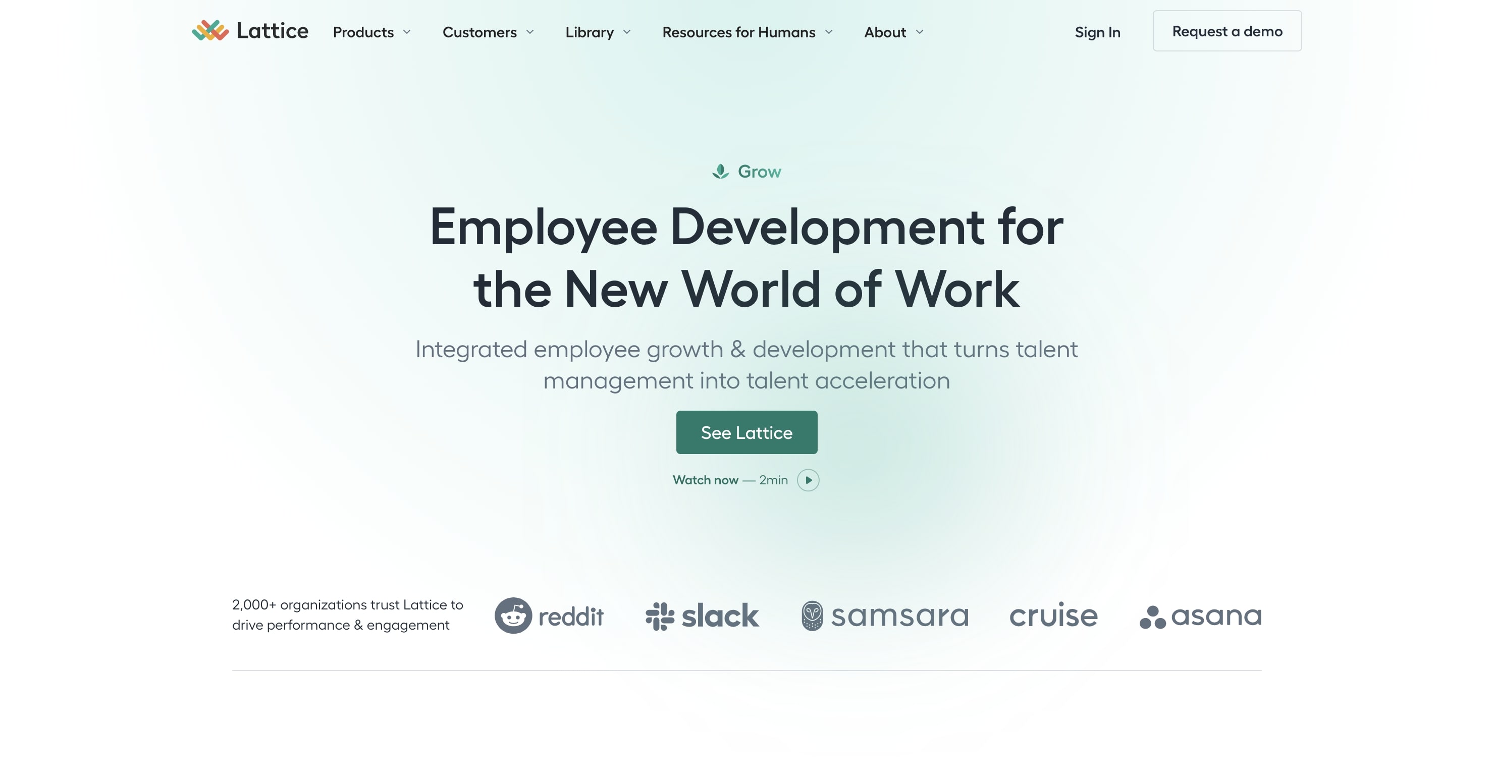
27. Lattice Grow
Lattice understands the power of the scroll, and they’ve incorporated this power in their landing page design in Webflow!
Rather than using the power of the scroll as a storytelling device, Lattice goes a step further and implements this interactive tool to show the visual transformation their product offers.
If a visitor happens to be confused, no worries — the top of the page features a video demo of their product.
28. AngelList Venture
AngelList Venture reimagined how to use a landing page to pitch new ventures and onboard new investors (and they did so using Webflow)!
Each fold within the web page persuades visitors to invest in some of the best startups around the globe. But AngelList doesn’t depend solely on graphics and copy to communicate their value.
They utilize live Tweets from actual investors and recipients of such funds to speak for them. This inclusion truly goes a long way. It humanizes AngelList Venture’s efforts and gives further credence to their platform.
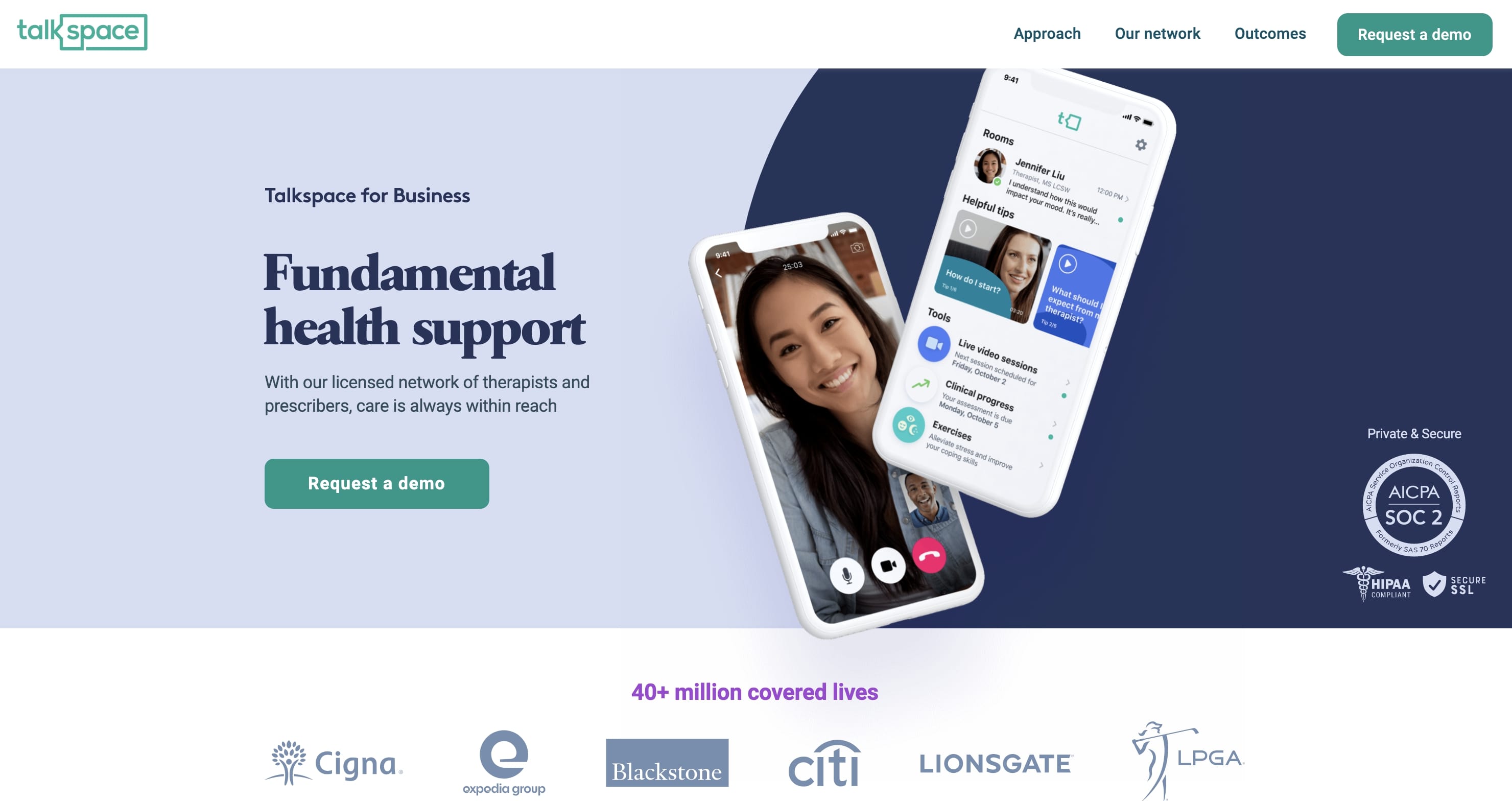
29. Talkspace for Business
Talkspace has humanized their Talkspace for Business landing page through choice transitions and motion graphics, connecting their messaging to their web page so it resonates with their target audience.
Take a look at their landing page and see for yourself. These subtle movements give a lifelike quality to their landing page design. Also, it’s worth noting that this was made in Webflow.
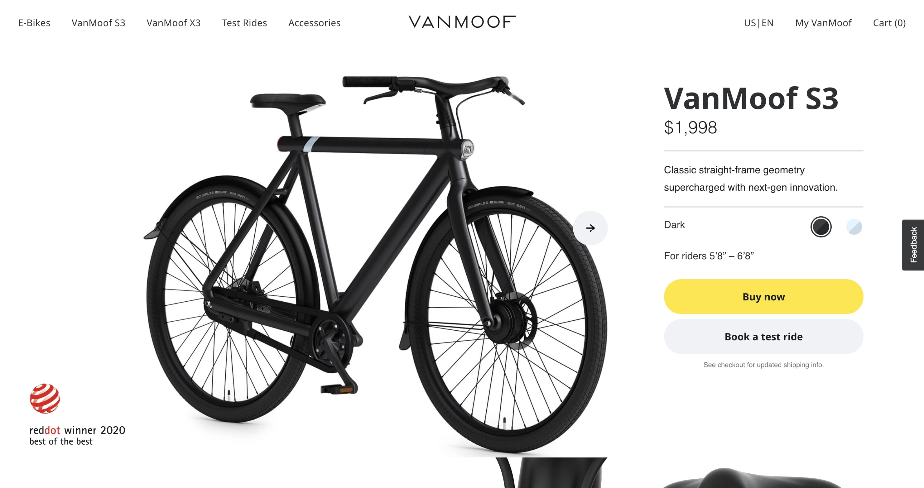
30. VanMoof S3
Apple has set a new standard for product web page design, and VanMoof’s design team has risen to the challenge with their landing page design for VanMoof’s S3.
The power of the scroll and their captivating visuals reveal an almost sensual and futuristic experience for VanMoof’s S3 next-gen model. Invoking these sentiments through page design is and always will be an innovative way to persuade an audience to invest in a product, regardless of the hefty price tag.
Scrolling through this landing page, you don’t want just any bike, you want the next-gen VanMoof S3. And it’s all thanks to immaculate web design.
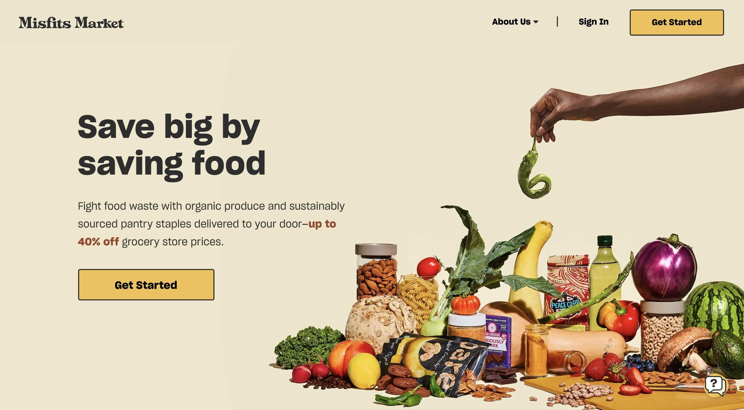
31. Misfits Market
Misfits Market shows us it’s not always transformative landing page design that helps secure lead generation. Rather, it’s effectively translating your brand’s identity into website form.
The branding is truly the champion of this landing page. Misfit Market smartly uses the principles of rhetoric to persuade their target audience of their value.
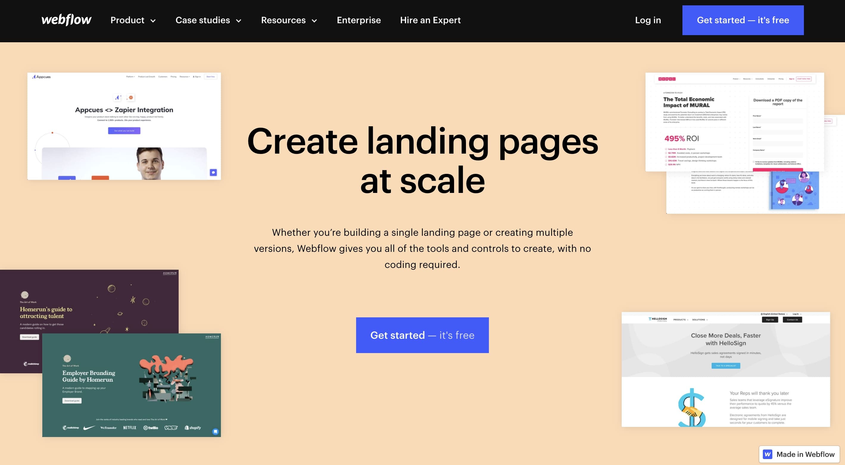
32. Webflow landing page use case
To conclude our list, we’re featuring our own landing page about landing pages. Yes, we know, but we simply couldn’t resist!
Webflow’s landing page about landing pages is an extensive in-depth how-to guide for getting started designing your own landing page with our web builder platform.
This is quite a simple and straightforward web page. Its sole purpose is to provide visitors all the necessary information so that they’ll have both the means and confidence to get started designing their own landing page.
And with three choicely placed CTA buttons, detailed on-page resources, and a lineup of some of the most popular Webflow templates, getting started is a click away.
So there you have it — our exhaustive list of some of the best landing page designs you’ll find online. We hope you enjoyed these web designs and found these examples both insightful and inspiring.
Your landing page is your sales pitch
Great landing page design requires a deep understanding of your users problems and needs. Next time you go out and create a landing page, ask yourself, “would this page help me sell my product if I were to meet the customer in person?”
If the answer is no, make sure the content on your landing page is designed based on the AIDA format — grab your target audience’s attention, build interest and desire for your solution to their problem, and persuade the visitor to take action.
We hope the examples above give you some inspiration when designing your next landing page. And if you want to get started building your landing page in Webflow, be sure to check out our full landing page tutorial: