Growthmentor
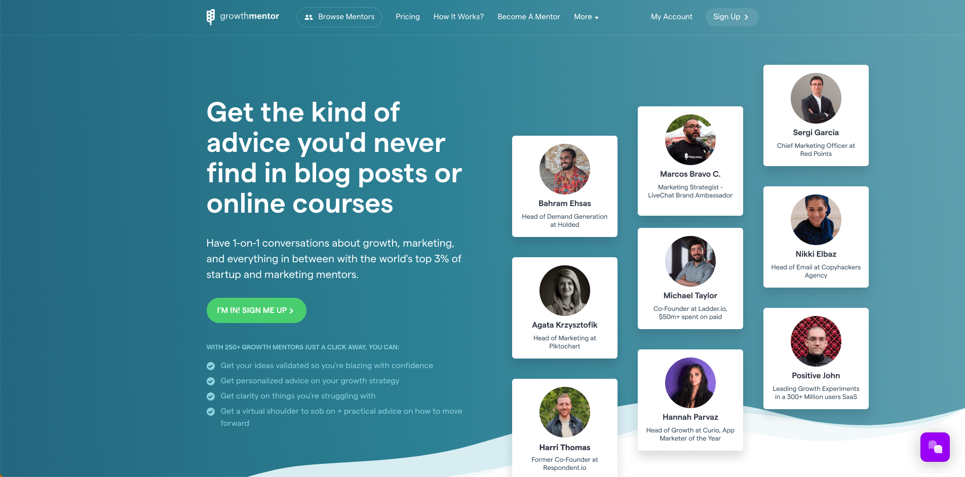
The way Growthmentor structured the information on the website and how they pitch their value proposition on the homepage is fantastic.
A visitor can understand what kind of services the platform provides without having to scroll too much.
With the right design, they can allow visitors to digest a lot of information will little effort.
Screenshot of Growthmentor.com
Pizza Pizza
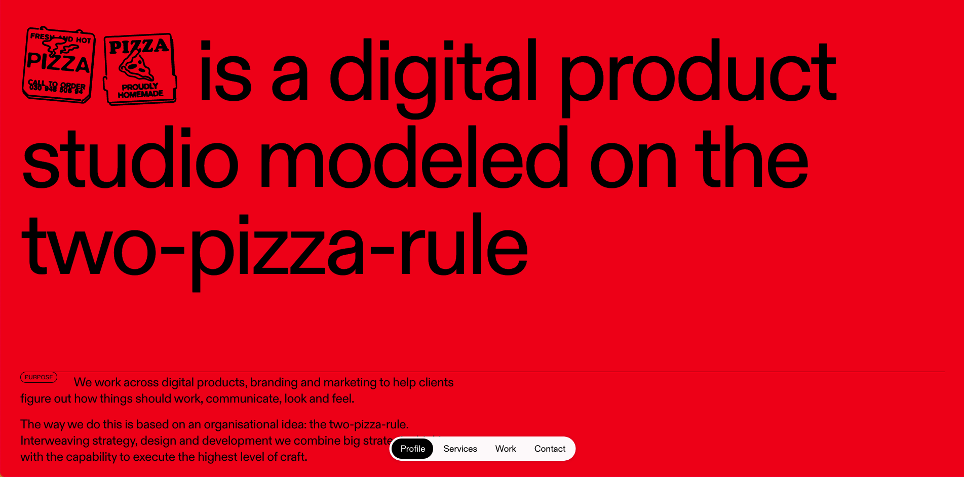
Pizza Pizza is an excellent example of a mobile-first PWA website. The navigation is built like a mobile app so that the website feels native on mobile and desktop.
With responsive web design essential these days, Pizzapizza implements it with elegance and creativity.
Screenshot of Pizzapizza.io
Zoox
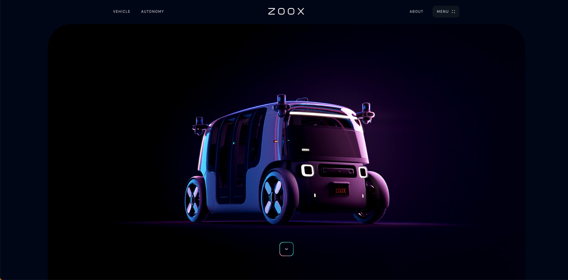
Zoox is an excellent example of using Lottie animations as part of your website design to showcase products and services.
Screenshot of Zoox.com
Basecamp
If you’ve dove deep enough into the product world, I’m sure you have heard of Jason Freid and the products his teams have built.
Basecamp to Hey, they all share a similar aesthetic, information structure, and transparency within their landing page designs and websites.
Screenshot of Basecamp.com
Github
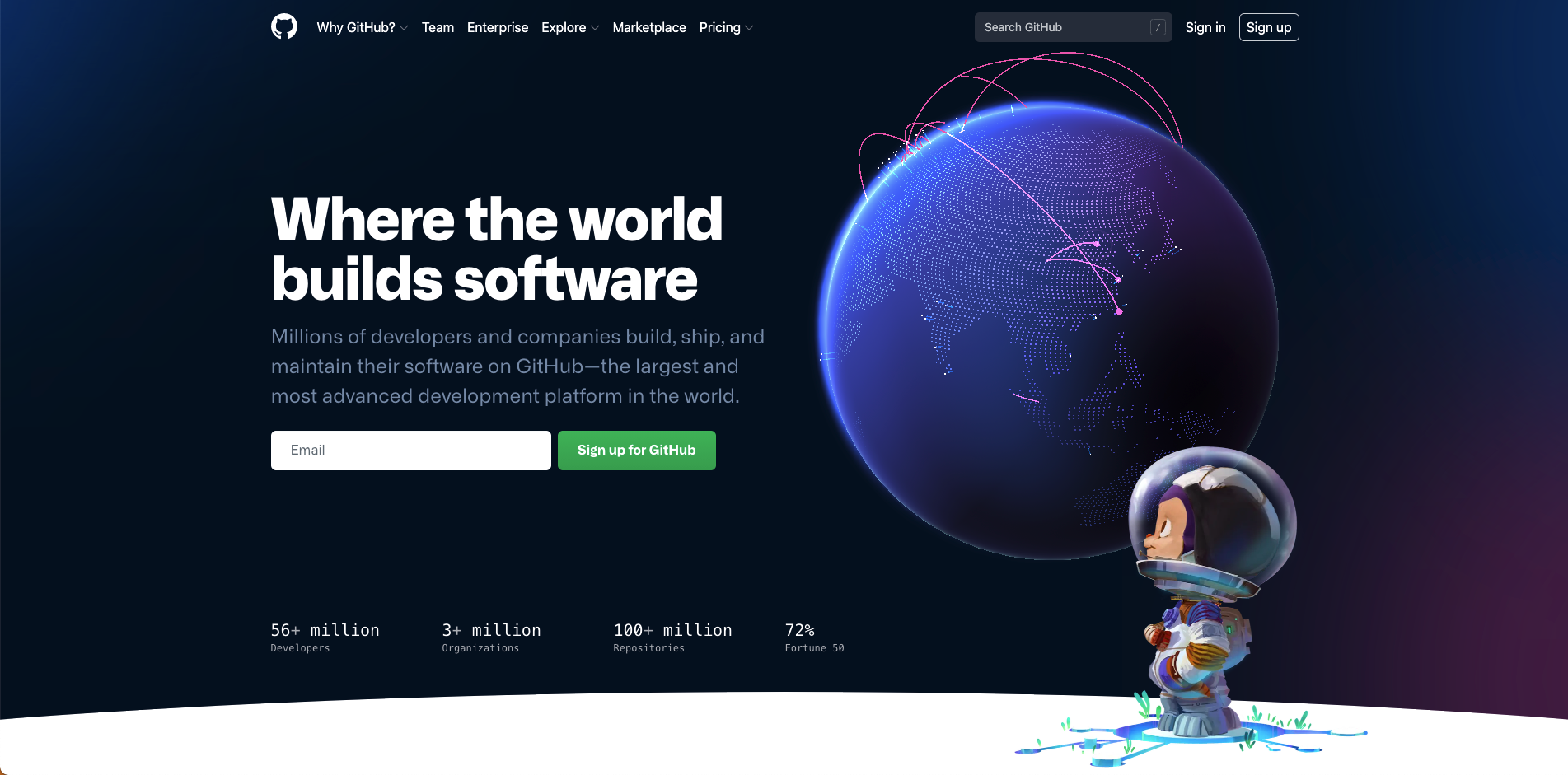
A recent update from Github. The redesign reminds us of another small company called Stripe with the Globe and their features’ animated mockups.
Nevertheless, it is a great website and landing page that we enjoyed diving into.
Screenshot of Github.com
Foundation
You may have gotten tired of the NFT hype, but we love the Foundation.app.
Screen of Foundation.app
International Energy Agency
A lot of people think boring, outdated, or distasteful when they think of corporate websites.
However, the International Energy Agency website designed and built by Area17 is an incredible example of a fantastic corporate website design.
Screenshot of IEA.org
Cord
Very recently release the website for the Cord app was designed and developed by the team at Bakken&Baekken.
The website uses illustrations and precise linework that effectively shows the capabilities of the product and potential integrations.
Screenshot of Cord.com
Italic
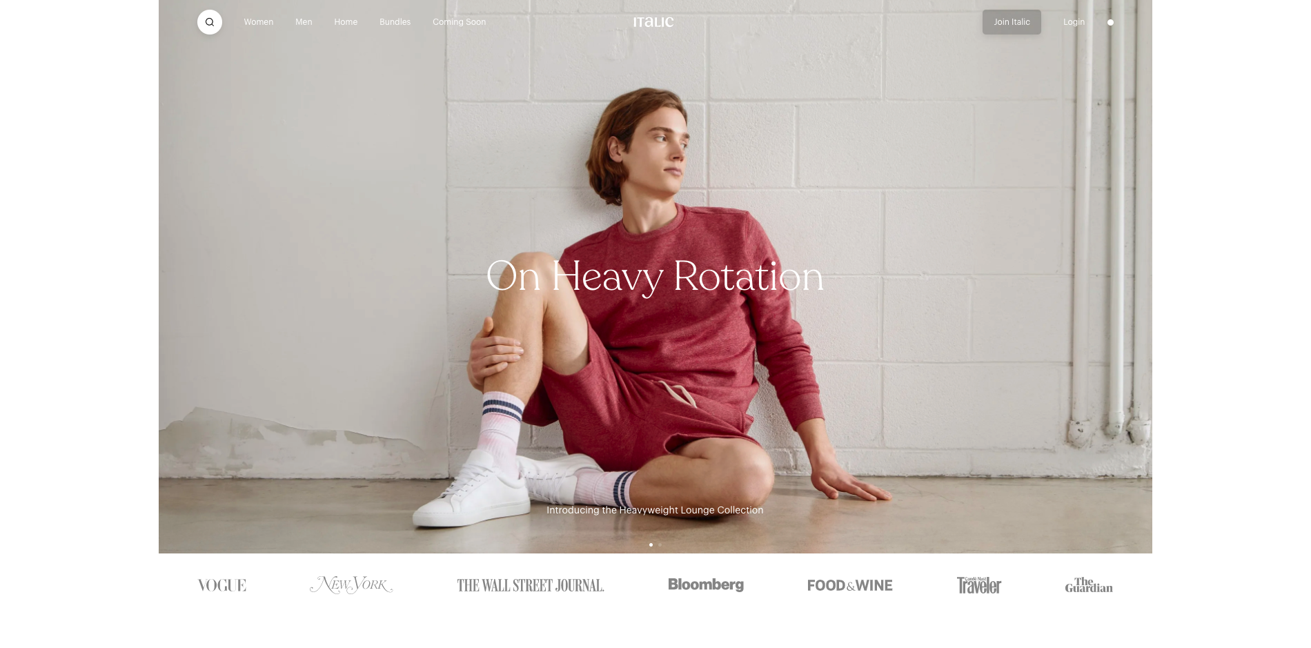
Italic is a direct-to-consumer eCommerce website with an excellent interface and user experience.
We love how the UI and experience were crafted and put together as part of their eCommerce website design.
Screenshot of Italic.com
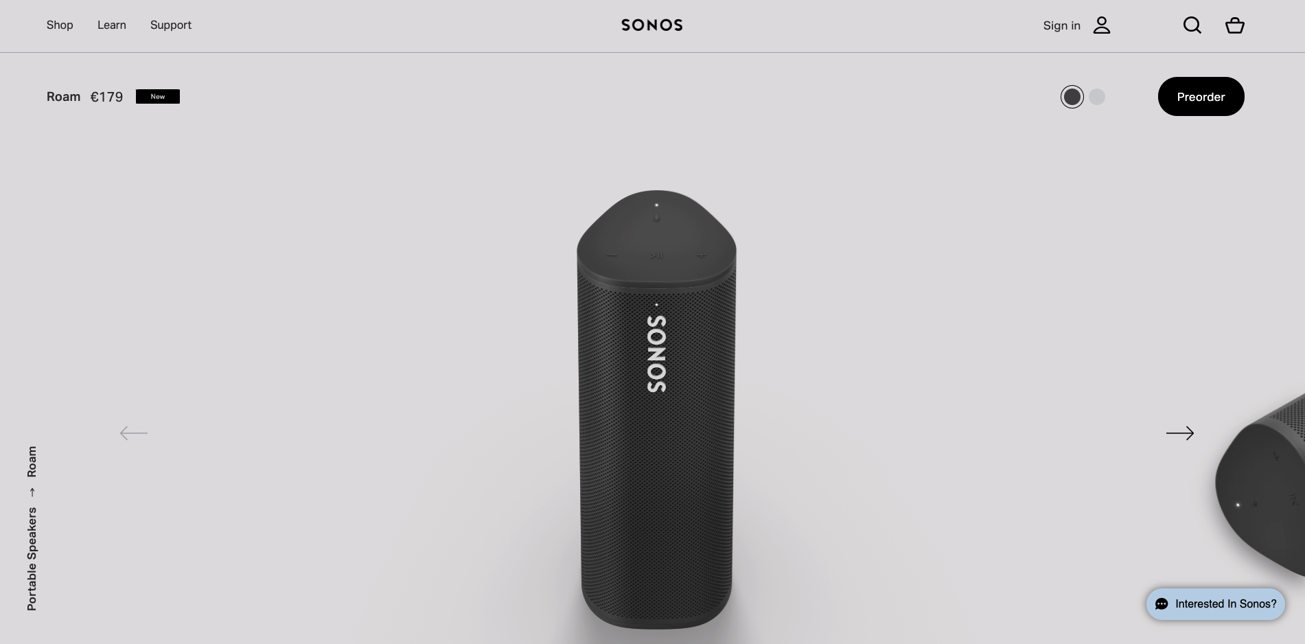
SONOS Roam
Having a mobile-first approach to your landing page design gives freedom to create effective ads and promotions for mobile and desktop.
Screenshot of Sonos Roam landing page
