
Notion app redesign, a small product design case study
Introduction
Notion is one of my favorite and one of the most used pieces of software at Tenten Creative. The flexibility and versatility make it extremely useful for anything you’re doing. From creating documents, curating mood-boards, research, and even project management. We can talk about how amazing the Notion desktop apps are all day long, but let’s talk about the mobile experience.
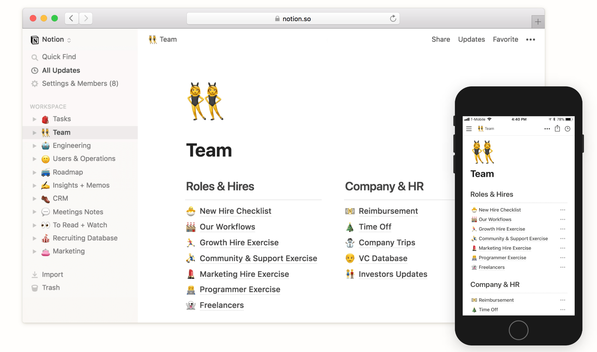
Anyone who has used Notion for a long time knows that the mobile experience is far from being as intuitive and clear as the desktop apps. From experience using it personally and seeing colleagues use it, I’ve seen and experienced mis-clicks, wrong gestures, mis-edits, and lots of misunderstandings in areas such as navigation, editing and etc…
Thus, here I would like to make a small improvement to some parts of the Notion mobile app to make it more user-friendly, clear, and overall give users a better experience.
How will we be doing it?
Even though there are lots of areas for improvement within the Notion mobile app, we’ll be focusing on the Navigation and the New Note sections.
The reason for this is because these are the sections that contribute to most of the problems users are facing while using the mobile app.
Also while it is fun to create a whole new redesign, we would like to create something that is realistically feasible, developer-friendly, and something that does not require extensive resources to create and implement.
Now that we have set the scope of the redesign, we can begin.
What is our Goal with this redesign?
By creating an objective we can be sure to stay on track not lose sight of our main goal while discovering different kinds of problems and solutions.
To reach our objective let’s ask ourselves a couple of questions that will help us discover our objective and goal.
Goal: Improve user experience by making the Notion app’s navigation easier and more intuitive.
With our goal in mind, we can continue our process to find the core problems. Upon finding the core problems we will be able to identify our objectives that will make our goal possible.
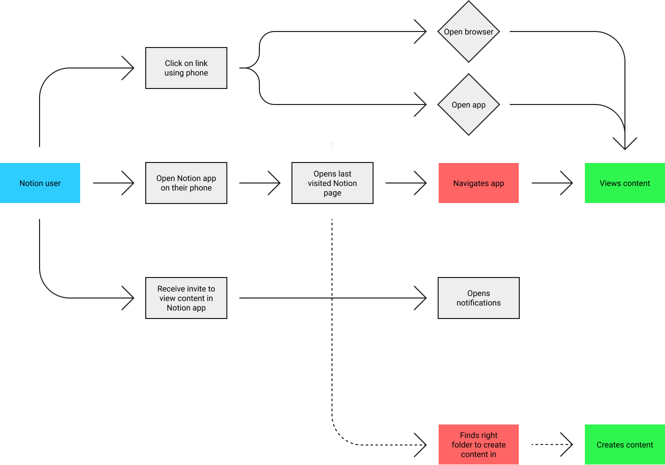
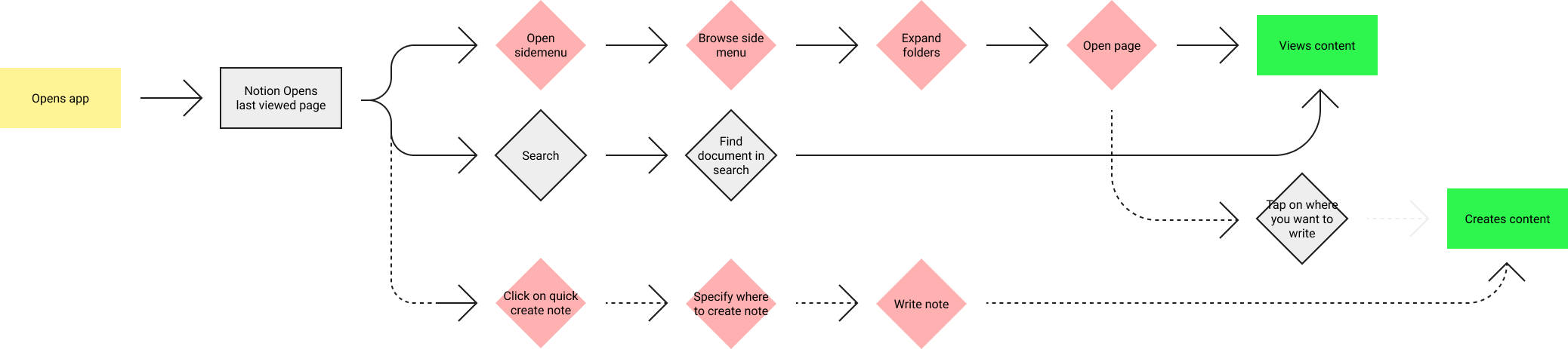
User map
Let’s start by creating a user map of how users create and view content within the Notion app. The user map helps to identify where the users may face problems and in which context do these problems occur.
Understanding how the product is used (Asking the experts)
I consider myself and our company as heavy users of Notion, thus I think it is quite safe to say that analyzing our own behavior and analyzing how our colleagues use Notion is a good source of data.
After talking to our colleagues and scouring online forums and discussions based on the Notion mobile app. Users usually use the Notion mobile app to look at content, make small edits and create quick notes here and there, hardly for intensive document creation and curation.
It is understandable as use a small touch screen to interact with all the blocks and to edit text can be quite fiddly and troublesome for most people. Whereas using a mouse and keyboard is more accurate and users are less likely to make accidental taps and mistakes.
Desktop = Content creation
#Mobile = Content consumption
The problems with Notion’s mobile experience. (Navigation & Note functions)
Here are the findings of all the problems with the Notion mobile apps. Based on interviews with 10 colleagues, we can see that the following are the most widely experienced problems and pain points of the Notion mobile app.
Pain point 1: Menu button & back gesture confusion
Swiping from the left side of the screen to the right does not open the menu, rather it goes back to the previously visited page.
After interviewing colleagues and friends who use Notion, there was a common behavior occurring where users mistake the back gesture for the gesture to open the side menu. In most commonly used apps with side menus such as Slack, Reddit, Linkedin, Instagram (Not a side menu, but story function) and etc, the initial swipe leads you to the menu or a function.
Or after opening a few pages these apps’ swipe gesture turns into the back function until there are no more pages to back to, which then, the gesture would turn into the “Open menu” function.
In the Notion app, even though you have swiped back as far as you can go, you still cannot open the menu using the swipe gesture, it will keep going to the page previously visited (not the previous folder). On top of this because people are so used to using apps that open the menu using the swipe gesture most people kept on confusing the two actions. There is no clear differentiator for the 2 functions.
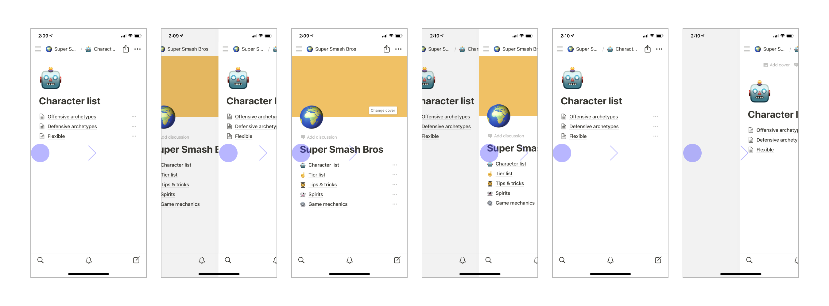
Pain point 2: Breadcrumbs
The breadcrumbs do not allow you to quickly navigate through the parent folders of the pages you are viewing.
The current breadcrumb design does not allow you to quickly and efficiently navigate through the folders and pages. Instead, the user has to click on the breadcrumb which then the app takes you to a separate screen to navigate the clunky folder branch screen. There can be an improvement here to make navigation more fluid and efficient.
Pain point 3: Ambiguous end to the note
The function to end writing a note is unclear

Currently, there is no clear end to writing a note, you only have a collapse keyboard button. When collapsing the keyboard knowing whether collapsing the keyboard saves the changes or just collapses the keyboard without saving is very ambiguous. Without a clear “end” button on the mobile version, it is confusing whether the note has been saved or not.
Pain point 4: New note location
Once you start writing a note, the indicator to tell you where you’re writing your note disappears, unless you select a folder to save the note in. Causing some users to forget and lose the location of their notes.

The problem is that by default when you write a new note and do not specify in which folder you’d like to put that note. The name of the folder or location name disappears once you start writing. And then when you want to look for the note and try to open the menu with the swipe, you go back to the page you had visited before, losing that note.
Pain point 5: Can’t change note location once a user has started writing
Once a user starts writing a note, the user cannot change the location of where they want to save the note.
Currently, the Notion apps only allow the user to decide where they want to save the note before they start writing. Once they start writing the option to select the location of the note will disappear.
Pain point 6: Accidental taps and edits
When you accidentally edit a document there is no way to discard the changes. (This happens a lot)
Using the Notion app to browse and consume content can be a fiddly process. As it turns out that users usually accidentally tap on certain places and accidentally make edits or add random letters and spaces to documents. Once you’ve made a change, you cannot cancel the edits you have made. I understand that Notion is a live collaboration tool, however, instantly saving any changes made on a touch screen can be debatable as the accidental clicks compared to the desktop apps are much higher.
Our objectives discovered
With our problems listed, we can now create a list of objectives that we must fulfill in order to reach our goal.
**Objective 1:
**Make the functions to open the side menu and to go back to the previous page easier to distinguish.
**Objective 2:
**Make navigating folders more fluid.
**Objective 3:
**Make the functions and actions while creating a new note more predictable.
Solutions
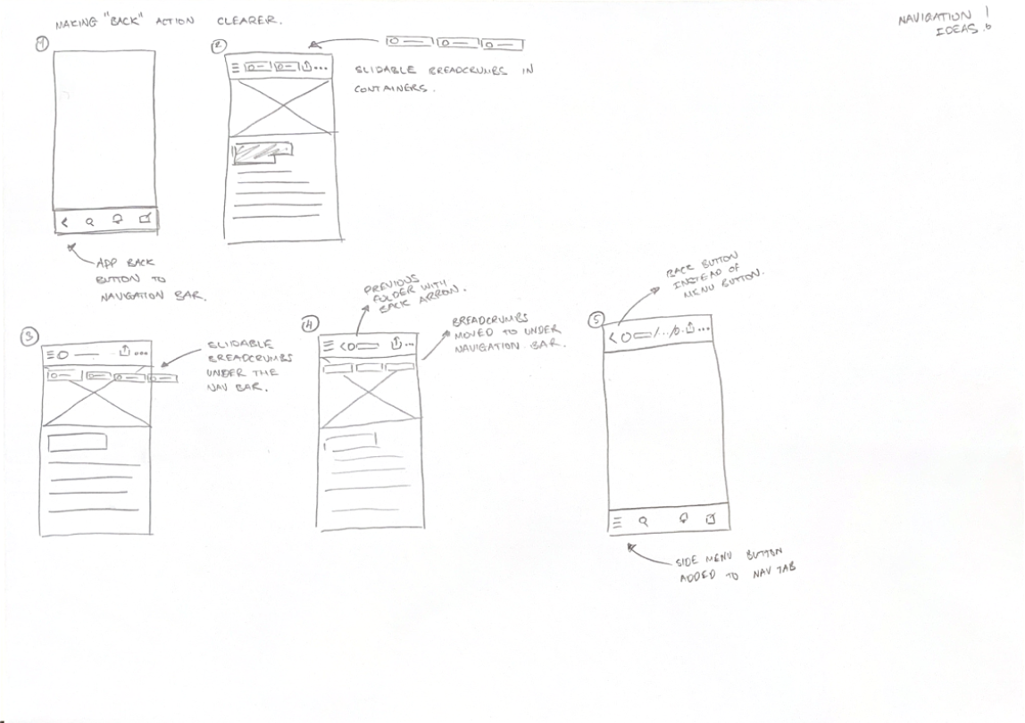
Now that we understand the full scope of the users, the problems, and our own objectives. We can start generating ideas on how we can solve those problems within the constraints we have. Even though we followed the design sprint steps previously, we will not be doing the “How might we” method in this stage as that method is catered for organizing solutions and problems for groups of people rather than a single person generating ideas. Instead, we will be sketching and wireframing ideas straight away.
Our main objective here is to generate as many ideas as possible and choose from the best ones that will be implemented in the prototype. Below are a few examples of the wireframes sketched to visualize ideas in low fidelity.

And finally…
Improved Notion
The updated version of the Notion app focuses on ease of navigation and clarity, resulting in a more fluid and clear user experience. This redesign was created to make the biggest impact with the least amount of effort and resources expended from developers.
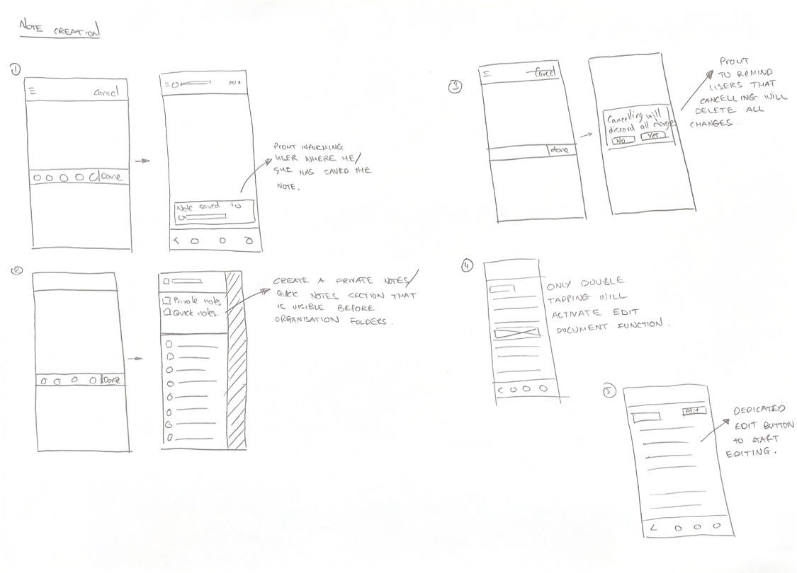
Swipe for menu, back button to back
Probably one of the biggest points of confusion in the Notion mobile apps. Without a dedicated back button, users had to guess if the swipe right gesture would take them to the previously visited page or to the side menu.
In the updated version, users have a clear visual of what they need to do to go back. Also, by dedicating the swipe right gesture to the side menu, users have better reachability when accessing the menu (Not have to reach for the top left corner of the screen whether you’re right or left-handed).
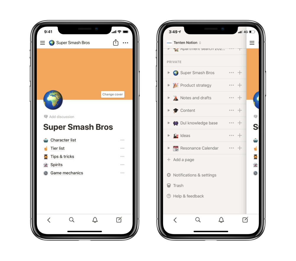
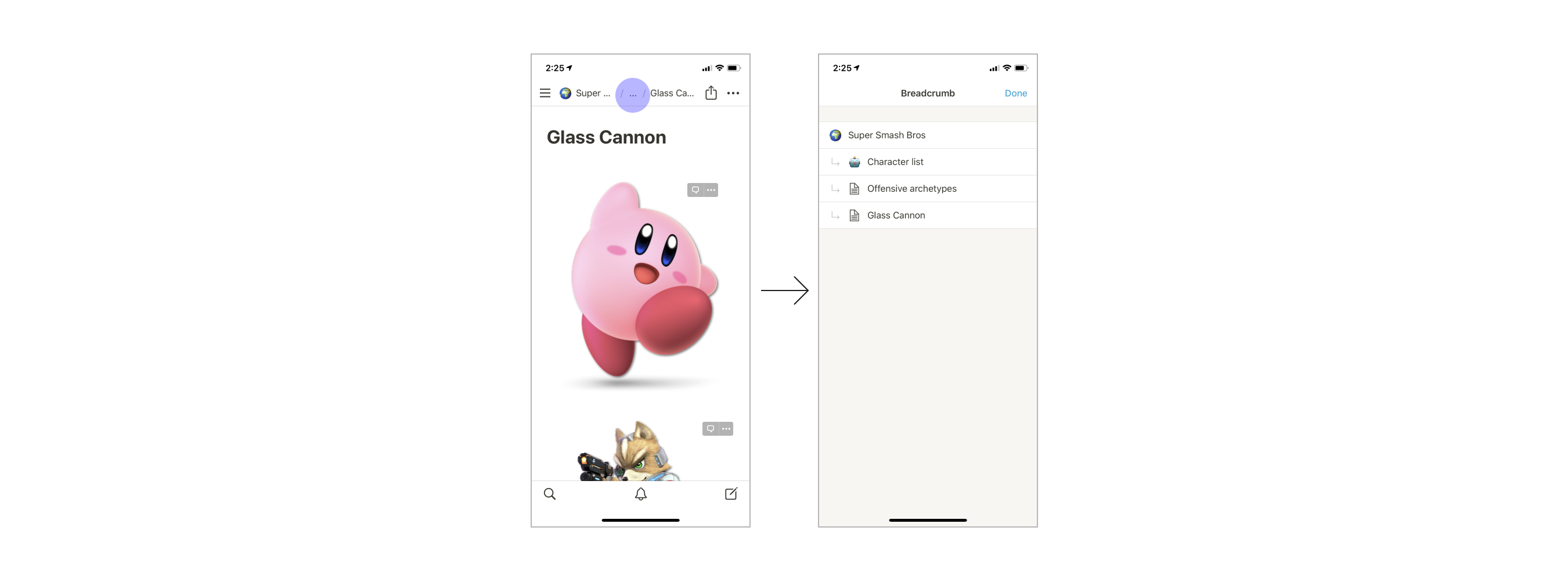
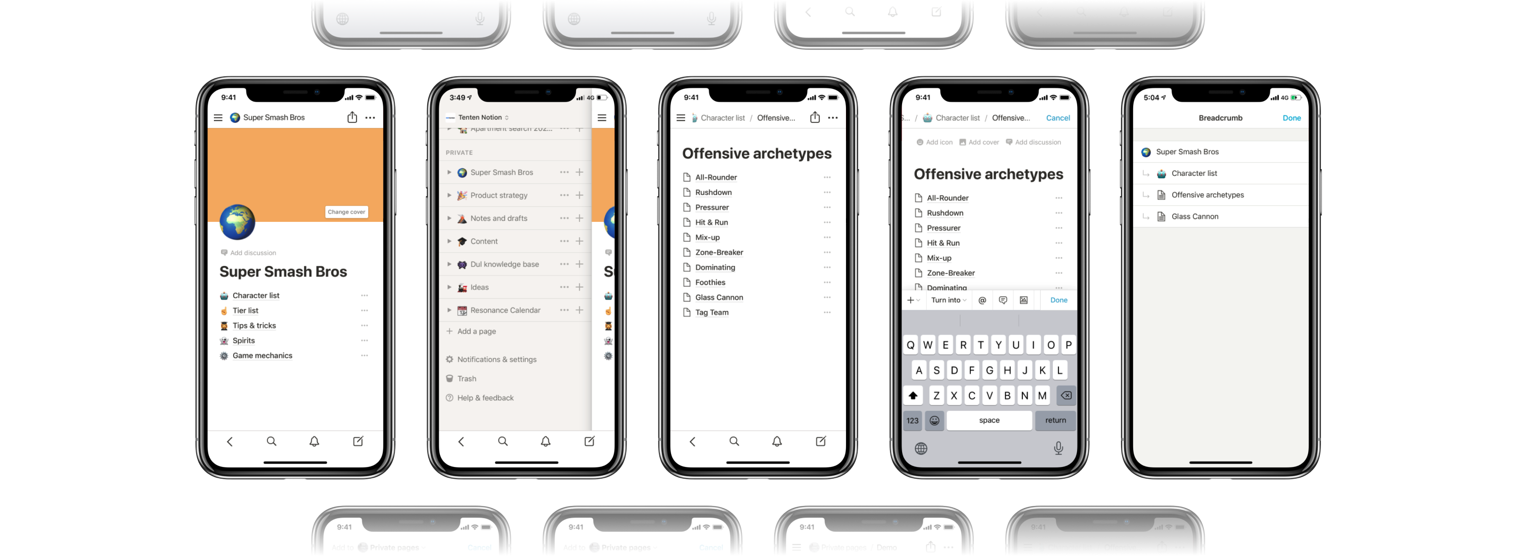
Better breadcrumbs
By making the breadcrumbs have the capability to be scrolled, users can navigate through folders much faster and easier than they could previously.
For when pages start to have layers and layers of folder a user would also be able to hold the breadcrumbs to view the old breadcrumb screen.
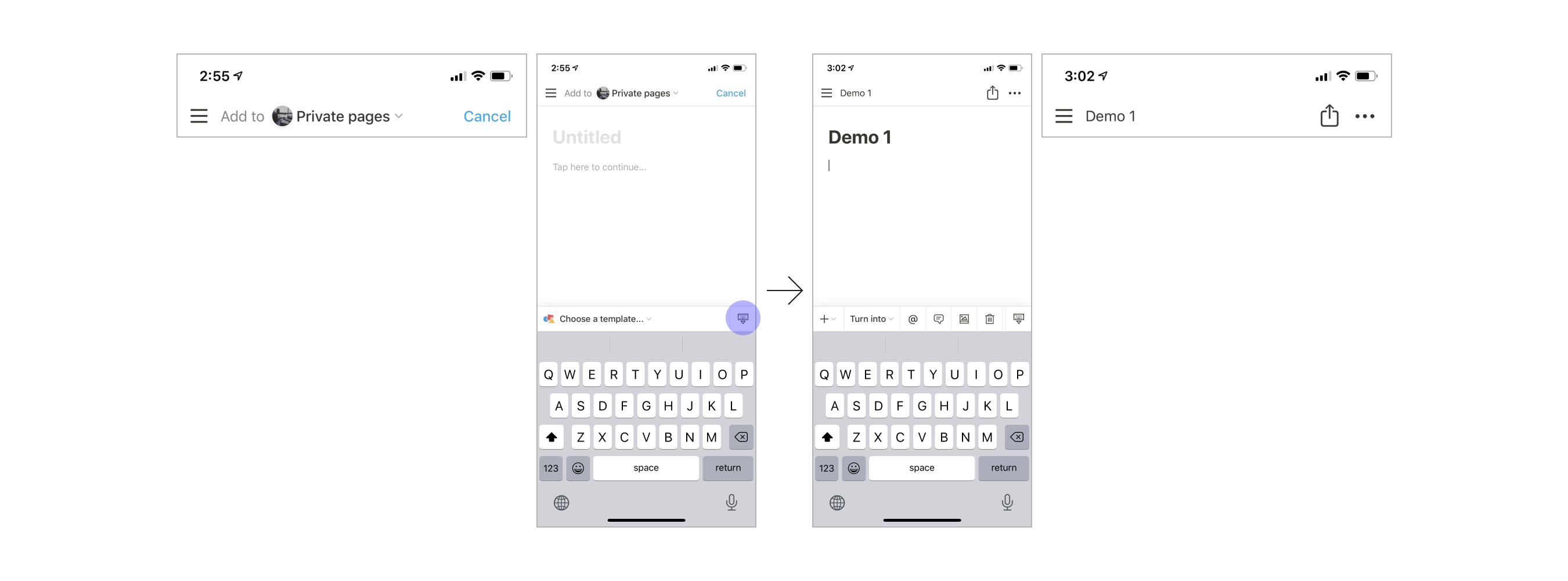
New note
We’ve made quite a few changes to the flow of creating a new note.
Let’s start off with the evident “Done” button on the top right of the keyboard. Before the “Collapse keyboard” icon had the role of ending the note-making/taking session. However, the indication to collapse the keyboard didn’t fully communicate that your note is being saved. Even though the function to collapse the keyboard is the same, by replacing the icon with the word “Done”, it becomes more clear to the user that clicking the “Done” button will save their note.
We have also updated the design so that the user is able to display and choose the note location while writing their note, giving them the possibility to decide where they want the note to be located mid-note. This allows the user to always know the location of their note, avoiding losing their document.
To make the note creation process more streamlined we deleted the possibility to access the side menu. The menu will be able to be accessed after the user decides to cancel or finish their note. This makes the note-taking process simpler and less cognitively confusing with lots of functions and options.

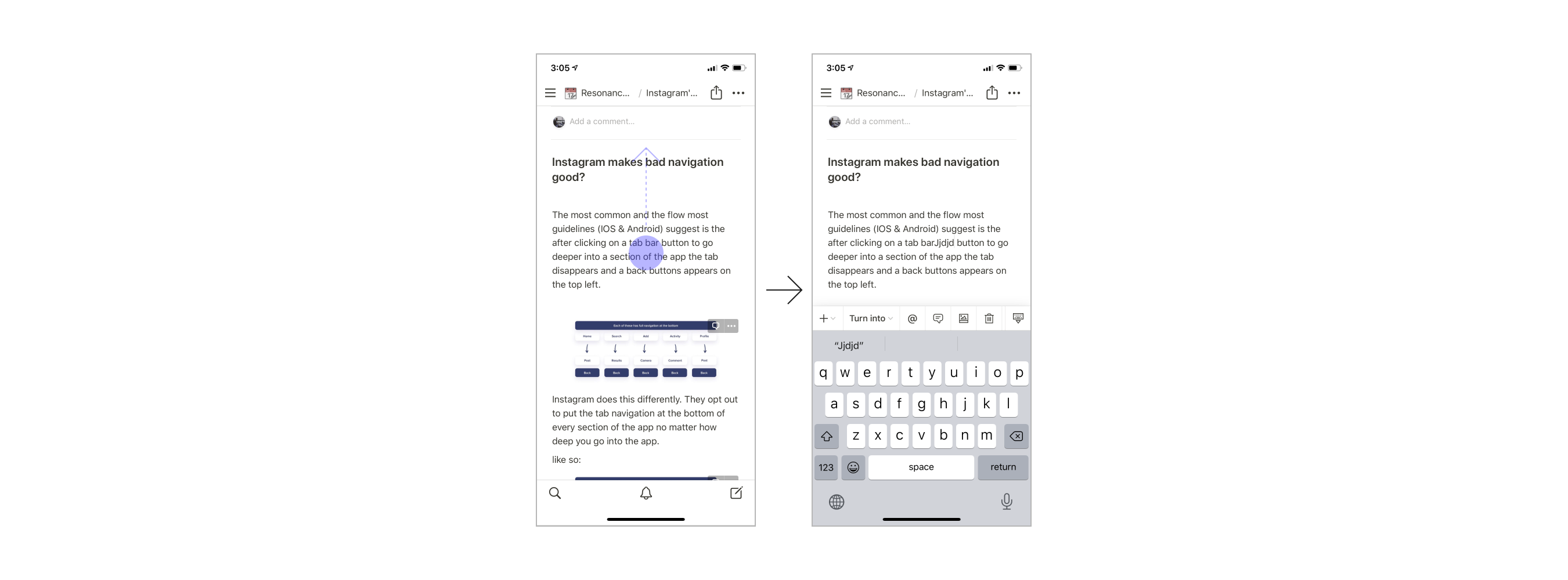
Discard changes
By creating options to cancel writing a note and finish writing a note, we can add an option to save or discard the user’s changes to a document. With this capability, we are able to allow users to undo all accidental changes made to a document.
Thanks for reading
Due to time constraints, user testing and additional deep analysis of the solutions have not been made. But I hope this short case study allows whoever is reading this that changes however small can affect the user experience in large ways.
At the moment, I do not know the current limitations and constraints the developers and designers at Notion are working with but I’m hopeful the team will work to make the Notion apps better.
Figma and Photoshop were used to create this redesign and article.
Source: https://tenten.co/chapter10/notion-app-redesign
**Dul Zorigoo
**Digital product designer Tenten Creative based in Taipei, Taiwan.