50 個優秀的 Facebook 廣告案例(以及如何編寫完美的CTA)
Want more email subscribers? Contest entries? Conversions? You won’t get them without the right call to action.
And since we want all of our readers and customers here at AdEspresso to maximize those conversions — getting both more sales and better ROI — we’re going to dive deep into CTAs here.

In this post, you’re going to see 50 diverse Call-To-Action examples (actually more than 50 since we threw in some extras to make our points).
We’ll also show you how to use them and provide some advanced copywriting tips to help you craft the perfect CTA.
No matter what you’d like to accomplish with advertising and marketing, you won’t do it without a compelling CTA.
Almost all of your campaigns and content should have a well-crafted call to action designed to drive action.
The calls to action that we use can determine whether or not people do, in fact, take action, along with how many.
But first…
What Is a Call To Action?
A “call to action,” also known as a CTA, is a term that you see used all the time in the marketing world. We’re not even sure how many posts we have on our site that include mentions of how important the right CTA is to accomplish your marketing goals, but we know it’s a lot of them.
So what is a call to action? It’s a phrase that’s used to tell the user exactly what action to take and how to take it. This can be as simple as two words (“Buy Now”) or a sentence or two (“Love learning about marketing and want to learn more? Subscribe now so you never a post!”), and it can be simple text with a hyperlink or a clickable button.
You’ve sold your product or company with killer ad copy and a great image or video — but now you need to make a sale or persuade your reader to leap into action.
So how do you create a persuasive and effective call to action?
We’ll get into that later. First, let’s talk about the importance of CTAs.
Why You Need A Strong Call To Action
A lot of business simply stick a “sign up” CTA in an ad and hope that it’s enough to drive conversions.
They put a ton of time, energy, and money into the creation of their ad, social media, blogging and email campaigns then slap a half-hearted call to action on the end of it. And they fail.
You don’t need just any CTA; you want a strong one that convinces people to act.
There are two main purposes of a call to action: to tell someone what they should do, and give them the motivation to do so.
A lot of people remember to tell people what they should do, but they forget the why part of that equation. Without that, you won’t see the types of conversion rates that you should.
While sometimes your content before the CTA will answer this question, sometimes it doesn’t. Even if it does, a quick recap makes the call to action more powerful.
How Long Should A Call To Action Be?
Can a call to action be longer than a sentence? Absolutely, yes.
That being said, they don’t need to be. It’s not uncommon to see CTAs that are only a few words long. While a call to action can be this short, especially clickable CTA buttons, longer CTAs can sometimes work in your favor.
Your call to action should be concise, in general, but that doesn’t have to mean ridiculously short. It means exactly that: concise.
The brevity and directness of a well-written call to action will put the focus on what’s important and remove any distractions.
When browsing through our selection of great call to action examples, you’ll see plenty of “long form CTAs” and how and when to use them.
We’re going to look at everything from placements to formatting, but we’re going to pay special attention to the language chosen and why it was used.
Best Call To Action Examples of 2020
Sometimes the best way to get really good at something (like writing a killer call to action) is to learn from others.
Now, let’s take a look at some great call to action examples from different corners of the digital marketing world to inform your own CTA-creation efforts.
We divided the list by groups:
Ready to dig deep into the CTAs Ocean? Let’s start!
Facebook Ad Call to Action Examples
Facebook is the king of social media and also digital advertisers’ best friend. It has more than its share of CTAs examples to inspire you.
Make note of these.
1. Purple
Although Purple’s CTA is simple, it compliments the video that uses an extreme example to emphasize the primary selling point of their mattresses: you won’t disturb your partner.

On the surface their “Learn More” button doesn’t appear to be one of the better call to action examples, combined with the eye-catching video that immediately attracts attention and Purple’s offer to let consumers try their product with no obligation, the simple CTA does the job of enticing consumers to want to get details about how they can try out the product for 100 nights and even have it picked up for a return if they’re not completely satisfied.
That makes it much more effective than many Facebook ads that use such a common CTA.
2. Animoto
Facebook advertisements don’t give you a whole lot of space (and users don’t always like to give you a whole lot of their attention) so it’s to your benefit to get right to the point. This is particularly true with video ads; users only want to read a brief description before deciding to watch.
Animoto took note of this in their latest ad:

Their call to action is clear. “Watch our Summit with these big influencers, and get 25% off our plan. Learn more about this here.” That is super direct, and it uses what I call the “Do this Because of This” formula (we talk more about that later on).
Basically, they’re saying “take this action because you’ll get this benefit.” It’s clear, it’s to the point, and it’s effective.
3. CanvasPop
A lot of marketers put their CTA underneath the image on their Facebook Ads, but this is an instance where it worked to place it above, in the larger and more immediately visible text:

CanvasPop’s “Get 60% off when you order today” is immediately evident, giving it a lot more visibility and power than if it were buried towards the bottom in smaller text.
They also preface it with a quick explanation of what you can get from CanvasPop so the CTA doesn’t fall on deaf ears.
4. Shopify
Mobile ad space is limited. This is where you want to get ultra-concise and fast. Shopify was able to do that in this Facebook Ad that popped up in my mobile newsfeed:

we’d almost be surprised if this wasn’t a mobile-only ad. “Sell Your Crafts on FB!” and “Sell online, in-store, and on Facebook…” are all incredibly brief, which works as a strong advantage on this platform where brevity is key.
The ellipsis following Facebook that leads right into the “Learn More” button is also a smart move, taking you from one thought right to the clickable CTA button.
5. Brandless
Brandless, the e-Commerce outfit that sells each of its items for $3, recognizes that video with a good CTA can be great for building brand awareness.

The “Shop Now” CTA is amped up with the statement that shoppers can find over 300 everyday essentials for $3 each.
They used snippets of video to capture interest and real users in, but kept their focus on getting Facebook users to act on the call to action.
The ‘brand’ also reinforce their CTA nudge with social proof in the form of customer reviews.
6. Lyft
With their ads’ ability to draw in both new riders and drivers, it’s no wonder that the ride-hailing app nearly tripled its number of active customers over a two year period.

In the case of the above ad, Lyft capitalizes on the fact that everyone would like to get free money. Assuming that based on name-recognition that people already know what they do, this ad offers a bit more context. The “Install Now” call-to-action button is persuasive because, coupled with the ad text, it leads directly to where new customers can learn how to claim their free $50 ride credit.
7. AirBnB
Taking the prospect of getting extra money to another level, Airbnb, the home-sharing platform, paints a convincing picture in the below ad.

This video ad features copy that asks viewers the question, “Do you want to make extra money” then offers homeowners a way to do just that. It also provides a tool that lets people calculate exactly how much they can earn on the platform. The “Learn More” call to action button caps off well-done ad that even offers a degree of personalization that speaks to potential users in a specific location, further zeroing in on their target audience.
8. Yeti
The outdoor products company best known for its iconic premium coolers and drinkware elevates a simple CTA, creating a highly-effective ad that speaks directly to their adventure-loving audience.

In this case, despite the run-of-the-mill “Shop Now” is all would-be customers need because Yeti knows its audience. They use fast cuts that capture people’s attention by highlighting how their brand fits seamlessly into the active outdoor lifestyle.
The CTA is more than enough to encourage users to click through since the ad copy and imagery persuasively taps into the ethos of who their products are created for, allowing the brand to target the segment of the nature-loving population willing to pay up for their high-quality products.
9. Hulu
Hulu, the popular online streaming service, uses a simple call-to-action button here, but there’s more than meets the eye.

The ad copy itself functions as a CTA, with fast animations and color swaps highlighting a lower price for a limited time. The video placement users’ attention and creates a sense of urgency, which is a great tactic for getting people to click the “Sign Up” button and become new subscribers.
Go Back To Call to Action Examples List
Instagram Ad Call to Action Examples
Instagram, the Facebook-owned visual social platform, is a place where just the right CTA can boost your ROI, as shown in the following call to action examples.
10. Instagram
The photo- and video-sharing platform itself uses a simple but very relevant call to action to draw in new advertisers interested in reaching its large user base.

To appeal to the many marketers interested in tapping their target audiences, Instagram extracts a photo from one of user’s past posts and uses it as the background for the ad that entices advertisers to reach new customers with a “Create Ad” CTA.
The tactic is to the point and very effective.
11. Starbucks
Starbucks, the coffee retail giant, is no stranger to using great CTAs to encourage consumers to stop in for a hot cuppa.

Starbucks is well-known for using bold and relevant CTAs to get people to click or swipe through. And the above ad is no exception.
They use nature-focused imagery and the colors of spring accompanied with a “Swipe Up to Try” call-to-action that prompts Instagram users to get in on Iced Matcha Green Tea Latte, a new flavor for the season.
12. MegFitzCooks
Plant-based home cook, Meaghan Fitzgerald, took a bit of an unusual approach to a call-to-action below.

To steer users to explore her feed and offerings, she ask them to tap and “Visit Instagram Profile. Since the micro-influencer isn’t overtly selling anything, more people were encouraged to click on the CTA.
After all, what did they have to lose by simply visiting her profile?
13. Spotify
Spotify is the Netflix of the music world, and to promote its services to music listeners it nails it with these two call to action examples. This first one from Instagram, targeting mobile users, employs the basic “Install Now” swipe up call-to-action, but the “Music You Love. Free.” text overlay acts as a CTA booster.

And in the following example (for web users), it shows that desktop users don’t even have to create an account to take advantage of its services. All they have to do is click the CTA, which will open up their web player and allow music fans to start listening with just one click.

14. Dollar Shave Club
Known for its smart marketing, Dollar Shave Club routinely uses some of the best call to action examples out there, so it shouldn’t be much of a surprise that they elevated a “Learn More” CTA with an offer that’s hard for many men to refuse.

The shaving product brand shows you how to make a standard call-to-action button stand out with a contrasting color, in this case a blue background that gives it real punch. But what makes this CTA so spot-on is that it makes it crystal clear what you need to do to take advantage of the persuasive offer made with the ad copy that promises you’ll get everything seen in the photo for only $5.
15. Ashy Bines
Australian personal trainer-turned-fitness brand used an interesting take on a call-to-action with this Instagram Stories ad.
Video Playerhttps://adespresso.com/wp-content/uploads/2019/03/Ashy-Bines.mp4
00:00
00:00
00:07
[Use Up/Down Arrow keys to increase or decrease volume.](javascript:void(0)
To promote the launch of their new mobile app, the brand used its namesake founder in a creative that showed her swiping up while encouraging users to do it, mirroring the action people could take with the “Swipe Up” CTA to install the application.
Go Back To Call to Action Examples List
Email Call to Action Examples
Email campaigns often overlook the importance of CTAs, but not these brands. There’s a lot to learn from these examples of eMail Call To Action that really nailed it.
16. Whistle
GPS provider Whistle uses CTAs to get pet owners to buy tracking systems to keep their tabs on their companion’s location at any given time.

Their email’s “Learn More” stands out with a bright blue color, providing a way for interested pet owners to find out more. For recipients who are already convinced to buy, the orange “Buy Now” further down the page provides a clear option to purchase without feeling pushy in way. Two CTA options implies they’re not only about the sell, but offering more information on the product.
17. De Beers
The diamond empire that built its brand selling love in the form of a precious gemstone used a unique CTA to target the bridal market.

The company made its call-to-action button stand out in two ways.
First, the CTA was created in a color that complimented the email’s design but stood out from it (in this case, light blue).
Secondly, to speak to women planning their big day, they formed an immediate wedding connection with the “Find Your Bridal Style” text on an unusually oversized CTA that attracts real attention.
18. Bed Bath & Beyond
One of the best things you can do for your call to action in an email message is to put the text on what looks like a clickable CTA button.
A great example can be seen here from Bed Bath & Beyond:

They use smart formatting- which is an important part of the CTA- to make a blue banner look like a clickable button. This, unsurprisingly, increases the number of clicks that it will get.
19. Birchbox
Birchbox, the beauty startup that jump-started the subscription-box craze, thinks outside the box with the call to action in the below email.

Instead of taking the advice of many email marketing experts who say CTAs should be “above the fold,” meaning recipients should see them without having to scroll down, Birchbox places its call to action at the bottom of this email.
To show the value proposition of their product offering, the box subscription service first showed people exactly what they’d receive as subscribers then used a CTA at the bottom in their brand color that stands out against the white space.
Go Back To Call to Action Examples List
Landing Page Call to Action Examples
Landing pages are mini conversion machines where the proper pitch can bring big results, as these call to action examples did for their brands.
20. Plated
There’s a ton of food subscription boxes out there right now. I can think of six direct competitors to Plated off the top of my head.
They make sure to use their call to action to drive home what makes them different: the is the food box for foodies.

They aren’t emphasizing convenience or health value the way some of the other boxes do; they make it clear that you will “get everything you need to make amazing meals- delivered in one perfectly customized box.”
It feels luxurious, and the use of “customized” makes it feel like you’re getting a luxury service from a personal chef, even though they’re still mass-produced in a facility somewhere. The “Sign Up Now” call to action is a bright pastel green that stands out immediately on the page, which again, is a huge bonus.
21. Monster
Sometimes the shorter the statement, the more powerful it is. Monster’s “Find Better” is an excellent example.
The immense shortness of just those two words is powerful, especially to job searchers who frustrated with their online job search. They go on to elaborate “Monster can help you find the best jobs, employers, and career advice,” explaining what “better” they can offer you.
Just in case you’re not a candidate, and are instead an employer, Monster has a smaller call to action in blue for you down below.
22. Suntrust
Suntrust’s call to action does something a little bit different that likely wouldn’t work for a lot of businesses, but it works for them.

They start with a negative in the form of a problem, saying “you can’t buy financial confidence.” They then immediately offer themselves as a solution with “but you can build it up at onUp.com.”
Problem/solution selling is a highly effective sales technique and it works, here, too.
The CTA button is what’s so unique. They say “Confidence Starts Here” instead of “Start Building Confidence Here.”
For most businesses (especially B2B businesses), using a more passive CTA like this one would not be the right choice.
23. Mint
Mint knows that many individuals might be skeptical about their service, so theirs is one of the call to action examples that is all about overcoming objections.

It only takes seconds, their CTA tells us. There’s nothing to lose (which they say right before adding a link in blue taking you to the security overview of the app), and financial freedom to gain.
Again, this is that high reward/low risk set up that businesses want to use to convince you to give them a shot. They finish off the sentiment by reminding you that you can, in fact, sign up for free with their clickable call to action button.
24. T-Mobile
This is a CTA that incentivizes one specific reward.
They don’t talk about how good their coverage is, or how their prices are competitive, or the amount of data or hotspots you can get like most plans. Instead, their call to action is focusing on something else: get a plan with us, and you get Netflix for free!

The emphasis is much heavier on the reward than the actual product. They talk about “binging your favorite shows at no extra cost,” instead of discussing something like “and never struggle with service again.” Their CTA is exceptionally focused, which helps it avoid confusing or distracting users with information overload.
Their “Get the details” clickable CTA is the right choice, too, sending users to more information about what types of lines qualify.
25. TurboTax
Many people dread doing taxes, but getting a jump on the annual process takes the stress out of the last-minute filing scramble.
TurboTax’s call to action reminds us this while simultaneously giving additional motivation to sign up now.
You’ll be ready for tax time, they say, because you’ll have a head start. And even better- you’ll save $10. They say to buy the software and have it ready, so you’ll be ready come tax time (as if any of us ever are).
It offers an external incentive and intrinsic motivation at once.
26. Freshbooks
Almost all small business owners are strapped for time, and Freshbooks’ CTA hones in on that pain point.
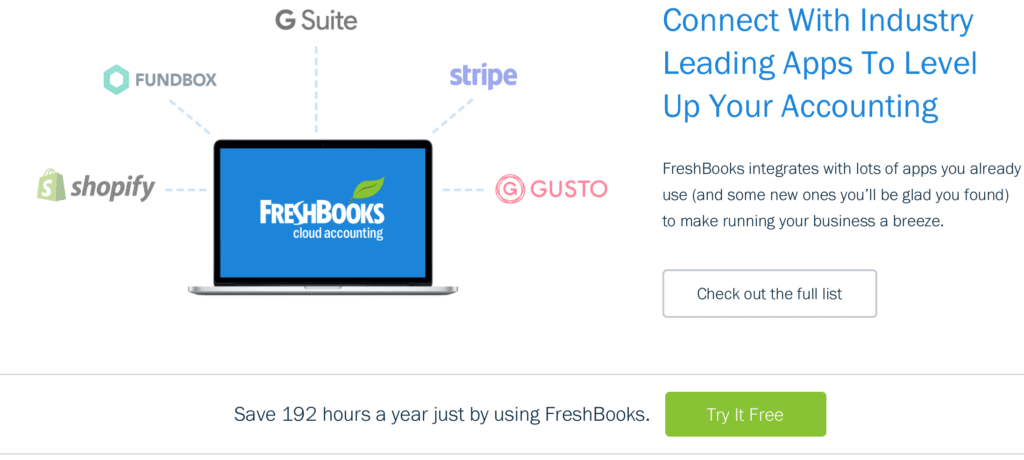
In contrast to a lot of call to action examples we see out there, FreshBooks gets specific.
They know that their audience is likely to be meticulous about tracking time and income for their business, and they appeal to that trait by having a call to action that says exactly how much time Freshbooks can save you per year (192 hours, in case you were wondering). They follow it with a bright green “Try it Free” clickable call to action that jumps out on the screen. Try not clicking after you read that!
27. Toms
Toms was recently (as of the time I was writing this post) having a flash sale. Or, as they put it in their popup, a “surprise sale.”
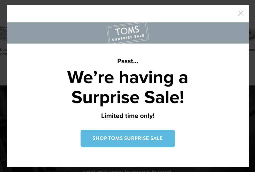
Their CTA uses a bright blue button to stand out against the rest of the box.
The copy is also well-written, implying exclusivity (which we know always sells). The “psssst” makes it feel like a secret, and the word “surprise” instead of “flash” makes it seem more intimate.
To top it off, they have a tiny “Limited time only!” but they neglect to say how limited that time frame is, making it more likely that people will sign up sooner rather than later.
28. Shakr
When you first visit Shakr’s homepage, the first thing you’ll see is two lines of copy telling you exactly what Shakr can do for you- help your business make great videos. Immediately underneath this, they have a call to action to “Sign up for a free trial account now” and an email subscriber box with a green “Sign Up” call to action button.

The button draws the eye in, and having the email sign-up box on the home page instead of having the call to action take them to the sign-up page is a great move.
It makes it exceptionally easy to take the desired action, strengthening the effectiveness of the call to action itself.
29. Backlinko
Backlinko, the SEO and link-building training brand, clearly believes in going big or going home when it comes to CTAs.

Their call to action literally dominates the entire page, making it a feature that visitors couldn’t miss if they tried. In addition to having an oversized CTA that stands in high contrast to the background, the bright “Sign Up” button immediately grabs attention, drawing the eye toward the CTA.
Go Back To Call to Action Examples List
Website Call to Action Examples
Both brand and e-Commerce websites are great places to use CTAs. Here are some well-done call to action examples culled from around the web.
30. Netflix
Netflix, the household name in streaming movies and TV shows, gets right to the point with their CTA:

“Cancel Anytime” immediately lets users know that there’s no risk associated with the free trial, while their “watch anywhere” sub-line promotes the streaming platform’s mobile nature that allows subscribers to watch their favorite shows wherever they may be.
Many consumers today are more skeptical about the fine print that businesses have gotten better at sneaking past them, so showing users that there’s no commitment and zero risks for them in the situation (aside from maybe getting hooked on Stranger Things, but that’s another story) will be sure to increase conversions.
31. WordPress Engine
This call to action is big and in-your-face, but it’s clear. It uses strong action verbs like “drive,” “build,” “protect,” “grow,” and “power.”

They also emphasize “faster,” using it twice to emphasize the rapid growth your business could experience thanks to their platform. It’s hard to say no to that.
Instead of encouraging you to immediately sign up, they know that you’ll want to learn more about the details and what they can offer, so they smartly chose “See Our Plans” instead of pushing for immediate signup.
32. Snappa
It’s not much of a surprise that graphic design software Snappa has a perfectly-crafted call to action.

Both the visual design aspects and the copy of this call to action are perfect.
There are two main areas of focus, both of which are in bright contrasting colors to the background to help them stand out. “Create online graphics in a snap” and “Create my Graphic Now” are both clear, concise statements telling users what they can do with the software, and that they should do it.
Since this is on a landing page, they put a brief introduction into the tool in between these two lines, explaining more about the service to strengthen the call to action.
33. Allstate
If you go to most insurance sites, they just have a box for you to enter your zip code and a “Get Quote” call to action. These work, but Allstate’s call to action stands above the rest.

They turned “Get Quote” into “Get a quick, personalized insurance quote today.” This will resonate well with potential customers, who are sick of seeing estimated projections on other sites (speaking from experience here).
34. VoiceNation
VoiceNation makes their call to action about you. You deserve more. The best. And now, you can experience the difference.

This is an excellent CTA. “Experience the Difference” is one of those lines that are really powerful as a CTA here.
It displays confidence that you’ll really see the superior quality, and they want you to experience it yourself with their free trial. Supported by smaller, subtle text demonstrating their high ratings, it’s hard not to want to see for yourself.
35. Bigstock
Bigstock’s CTA in their image search box is a great example of why you should give all CTAs equal importance, not just the ones that encourage an immediate conversion.

A lot of similar sites will say “Search images” in the search box. Bigstock, by comparison, encourages users to “Find the perfect image…” This implies that you’ll find the exact image that you’re looking for and you won’t have to settle, and the ellipses at the end is a good touch to make it feel like the images are just there waiting for you. All you have to do is search.
This will drive engagement on their site, which could result in paying customers.
36. Rothy’s
Most businesses do what we can to increase email subscribers. Email addresses are immensely valuable, giving you an easy-in to a customer’s email inbox and the ability to target them directly with Facebook’s custom audiences.
Shoe company Rothy’s call to action can give us some inspiration for how to increase subscribers.
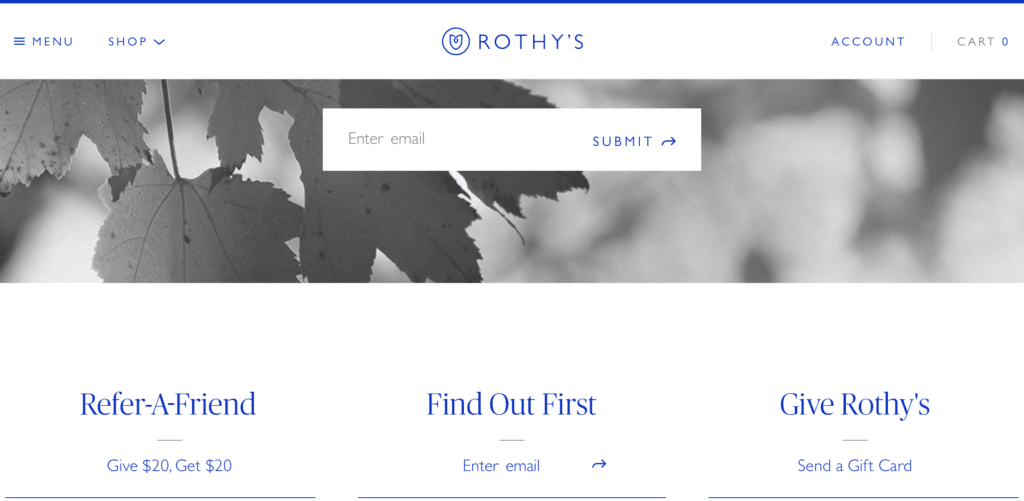
Rothy’s leverages exclusivity in their CTA to generate more email sign-ups by saying “find out first.”
Since everyone wants to be the first to know about new products, new sales, and news in general, this is a smart CTA that is sure to boost their email subscription rate.
37. Vanguard
Vanguard’s CTAs don’t aggressively sell on their landing page; instead, they start warming up the customer by using “you” language instead of “us” language.

Unlike many call to action examples, this financial services firm prioritizes customer’s needs. They use language like “See why Vanguard’s right for you” and “See how a Vanguard advisor can help.”
Even though their site copy is designed to sell just as much as their competitors, it feels more intimate and less aggressive. For tentative, overwhelmed potential investors, this can work to their advantage.
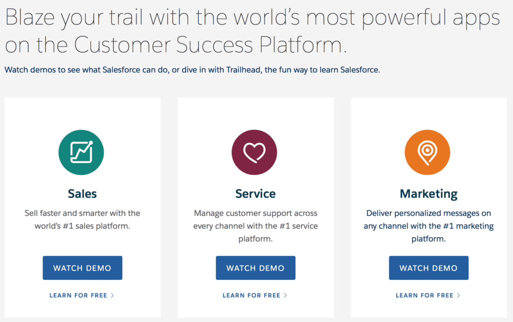
38. Salesforce
Salesforce’s home page has some of the best call to action examples that show how to drive users to the correct destination on the site. A clear example of this is the homepage’s top-of-the-fold content.

This home page has a “Try for Free” call to action button that’s immediately evident in the top right-hand corner, and a “Start My Free Trial” under an explanation of why Salesforce has gotten even better.
They also have a call to action button immediately underneath prompting them to “Learn more about the partnership.” This helps ensure that if users aren’t ready to sign up yet, you’ll be able to funnel them to more information that could change that.
Further down on the home page, they also have demos to show potential customers all the different features Salesforce has to offer. They use clickable CTA buttons to make it clear that users can watch the videos, and make it easy for them to do so.
39. Daily Look
Sometimes the best way to make your call to action more effective is to get creative with the pain points that you target. Realistically, personal styling company Daily Look has very little to do with finding more hours in the day and a lot more to do with buying expensive clothes.
Their call to action, however, gives customers a reason that they can shop guilt free.

“Leaving you time for everything else” is a genius move. It’s creative, and it creates the illusion of a pain point that isn’t really there right before the bright blue “Start Now” CTA.
40. Dollar Shave Club
Dollar Shave Club did it again with a well-conceived call to action on that speaks to their target audience.

Their message is clear: men can look, feel and smell their best.
Instead of using the “Try Us” or “Join Now” formula, the company promotes its free trial with an inviting “Get Started” button.
It doesn’t seem like you’ll have to immediately enter in your credit card or be sucked into a subscription, but the benefits as to why you’d want to try it are clear.
Go Back To Call to Action Examples List
Other Call to Action Examples
Great call to action examples can be found in a number of other places online, and here are some that offer lessons.
41. Williams Sonoma
CTAs don’t just belong in direct-sales content; regular social media posts can have them, too (as these William-Sonoma’s call to action examples show).
Encouraging users to sign-up, follow you on other platforms, engage in a contest, or visit your site will all be more effective when you spell out what they should do.

The above example post has a call to action to “get the recipe in the bio” instead of just hoping that customers will be interested enough to realize that the recipe was online.

In the above Twitter post, the retailer aims to bring its online following into stores with a class catering to their culinary interests incentivized with a $50 offer to sweeten the deal.
Both of these call to action examples are both specific and actionable, which all great call to actions should be.
42. The Great Courses Plus
The home study, college-level audio- and video-learning course provider used the following ad on YouTube to promote its classes:

They lure education-seeking users with a four-star rating, the opportunity to “Learn Anytime, Anywhere” and a call-to-action button that lets them install their app and prepare to start taking courses.
The Great Courses Plus also use the following web page with dual CTAs above the fold to nudge visitors toward to signing up for a free trial.

43. Houzz
Houzz is a design site that’s ready to help you redo your house. Because there’s a lot of interior designers, home remodelers, and sites out there that can help you find something you like it buy it instantly (um, Pinterest anyone?), they knew they had to use a call to action that would make them stand out.

“The New Way to Design Your Home” feels exciting and innovative. You can’t help but wonder what this new and improved way is.
Underneath it, they immediately offer several benefits to using Houzz and showing how it can help you. You can draw inspiration, shop, or find professionals to help you. No matter what you came to the site looking for, they can help.
After addressing that they can do everything any other site would do, but that they do it in a new way (which implies a better way), they place their call to action button that easily stands out against the backdrop.
44. MOO
MOO has outstanding business cards, and their quality is second to none. But if you haven’t seen one first hand, you might not believe them when they make this claim. It’s like how every diner in the world claims to have the world’s best cup of coffee; we all know that 99.999% of them are lying.
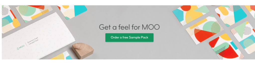
To overcome this and prove that they are actually superior, MOO has an offer on their site: “Get a feel for MOO” by ordering a free Sample Pack.
This is an ideal call to action for customers who are on the fence and looking at competition, especially since MOO is more expensive than most of their competition. They have to prove that they’re worth it first, and this is an excellent way to do so– especially since the literal feel and texture of the cards is what’s so important.
45. Simple Pin Media
Simple Pin Media makes great use of call to actions in their blog posts, and an example can be seen here.
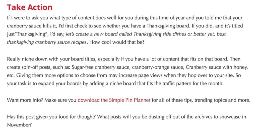
Towards the end of her blog post, pictured above, she highlights the CTA to “download the Simple Pin Planner” so that it stands out on the page, making it more effective.
It’s placed at the end of the post, once her readers know that she had valuable insight to offer and that the planner would be beneficial to them.
She also makes sure to explain why users should download the content in her CTA: “Want more info?” and “for all these tips, trending topics, and more” tells users exactly why taking this action would benefit them.
It’s still exceptionally concise, but it gets the point across.
46. Fairwinds
This call to action from Fairwinds credit union below is creatively written, uses bolding to emphasize the main point, and clearly explains the benefit of the program even though we don’t know what the program is yet.

“Sign up today and make saving money effortless.” You can’t really go wrong with saving more money, right? They also use “cents” as a pun on “sense,” and they bold the “cents” and the name of the program to make sure that you’re taking in key parts of the message.
How do you not want to learn more about making saving money effortless, after all?
47. World Wildlife Fund
The World Wildlife Fund takes environmental and animal activism serious and its CTAs show it!
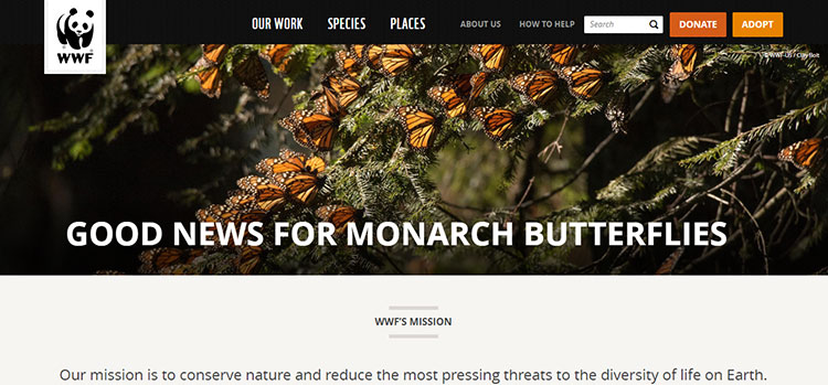
Just take a look at how beautifully the two key CTAs they use, “Donate” and “Adopt,” pick up the colors from the Monarch Butterflies in the hero image. This approach makes the buttons stand out enough to attract attention without seeming to obvious or out of place. They also manage to uses two colors to differentiate their call-to-action buttons in a way that neither one appears to dominate the other.
The CTAs effectively get across the point that you can contribute to their worthy cause by either donating money or adopting an animal.
48. Care.com
Care.com uses a non-committal CTA (free) that helps users decide if it’s the right for their needs.

Featuring two options, the first CTA is is geared toward consumers seeing a caregiver, letting them “Find care” in their local area with no strings attached, while the other focuses on job seekers, giving them a chance to create a profile and search for jobs — offering something for nothing is always a great incentive to use in a CTA.
This double-face call to action example shows how CTAs in one place can serve a dual purpose.
49. Dropbox
Dropbox has slowly moved away from its sparse design completely dominated by white space, embracing a still-simple but more colorful style with lots of negative space.

On a light blue background, they use a darker blue “Try Dropbox Business free” call-to-action button (it really stands out because it’s what they prefer users to click), with a less conspicuous outlined CTA button that allows visitors to “Get Dropbox Basic” as a no-cost alternative.

The above example, Dropbox uses a split screen design to emphasize two different options, each with its own CTA business.
50. Trello
There’s a body of marketing research that shows bold-colored CTAs can significantly increase your click-through rates, and Trello uses the approach to the max.

Set on a bright blue background, the green call-to-action-button with white text pops with contrasting color. Using persuasive copy in white the tells the product benefits, the CTA clearly tells targets what to do: click to sign up for FREE.
Go Back To Call to Action Examples List
Aaaaand here we are. Satisfied? Tired? You’re not done yet!
Keep on reading to discover how to Write Perfect, High-Converting CTAs Based on These Call To Action Examples.
Text by Ana Gotter
We’ve looked at a ton of call to action examples and got some general tips about approaching CTA creation.
Now it’s time to learn how to take the inspiration and spin it into gold for our own businesses.
If you are feeling pretty tired and run out of coffee, we summarized our bits of advice on how to create the best CTA for your business in the following box.
Keep it at hands reach for a quick refresh, but keep on reading to master all the secrets of the Call to Action creation process!
5 Quick Tips for Creating Great Call to Action
Alright. Now that we’ve taken a look at some awesome call to action examples, here are five nuggets of advice for building effective CTAs.
-
Start Your CTA With a Strong Action Verb
Don’t mess around. Quickly tell your audience precisely what you want them to do. For example, if you’re run an e-Commerce site, you may want to start your CTA with words like “shop,” “order” or “buy” or “get.”
-
Use Powerful Words
To elicit and strong emotional response from your audience, think in terms of creating excitement-producing CTAs like: “Get 75% off now!” or something like “Join to get $25 back instantly.”
-
Create a Reason to Take Action
Tell your audience exactly what’s in it for them. Tie in your CTA with your value proposition, giving your audience an incentive that motivates them, whether to save or make money, get fit, lose weight, grow hair, or anything else.
-
Choose a Good Color for Your CTA
While there has been a lot of talk about the psychology of color in marketing, the truth is you should select your CTA button colors to stand out so prospects know exactly where they need to click to take action.
-
Test Your CTAs
Just as with ad copy and other marketing content, it’s important to keep your CTAs fresh to be effective. Continually run A/B tests to identify which CTAs get clicks and which don’t and switch up depending on what works best.
Writing a good CTA is crucial and -fortunately- isn’t that difficult once you know what to do.
And really, all you have to do is follow these five steps.
Step #1: Focus on One Goal
The importance of this can’t be overstated. Each ad campaign should focus on one primary goal. Maybe the goal of your Facebook video ad is to drive brand awareness, for example, so it was created for a cold audience. That’s great! While other secondary results can occur as a result of the ad- like people clicking to your site or purchasing from you- these things should not be the focus if you’re trying to drive brand awareness. Your call to action should directly reflect that.
In the example above, you would want all call to action copy to reflect that singular goal. You’d choose a Facebook CTA button of “Learn More” instead of “Shop Now” or even “Sign Up.” But if you want conversions, run a separate campaign (with a separate CTA).
Let’s look at what happens when you don’t follow this rule. Apple has the following Facebook Ad running to promote the new iPhone:
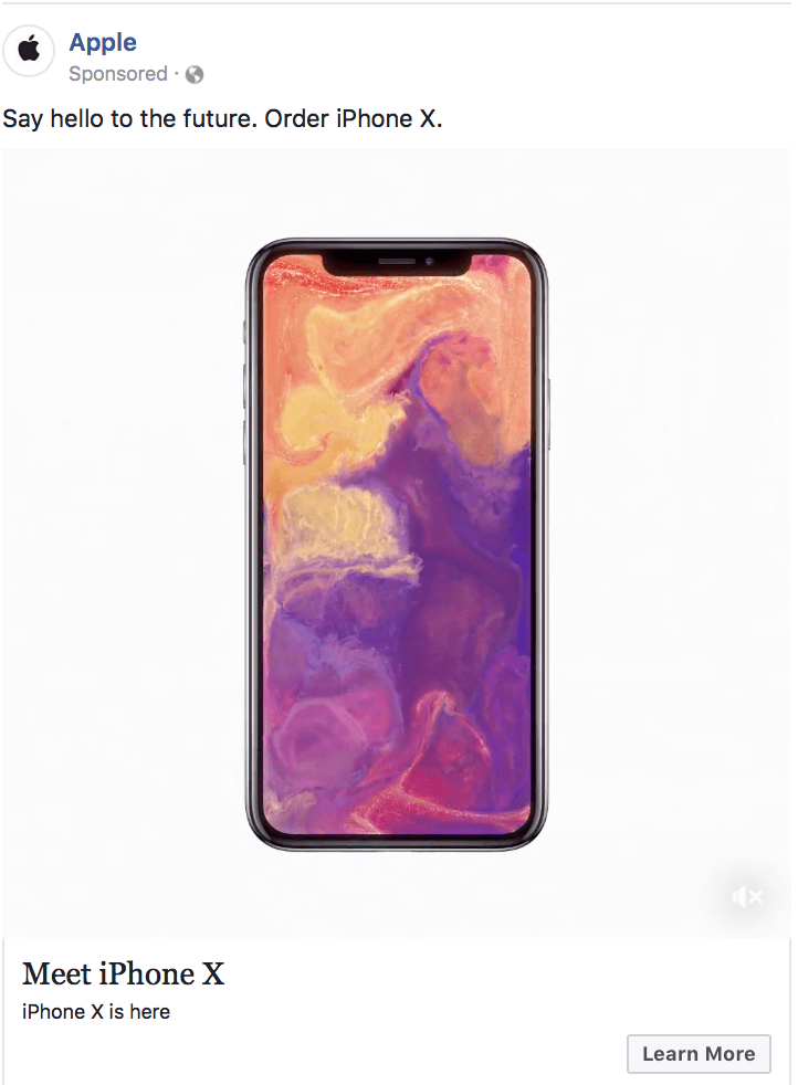
In addition to the ad copy being a little bit too receptive and lacking on the features, there’s a disconnect between the headline and the call to action. I love the headline “Say Hello to the future. Order iPhone X.” But then, instead of selling the phone in the description by listing features, they just say “Meet it. It’s here.” Then, the call to action says “Learn More,” when “Shop Now” would have been a much better choice when encouraging users to order it. It feels a little confusing and lackluster. While customers may not dissect this consciously the way we just did, you know they’ll register at least most of it unconsciously.
Step #2: Use Action Words
Also known as verbs, action words are specific and motivating. “Shop,” “Sign up,” “Discover,” “Try,” “Watch,”and “Start” are all examples. They directly telling customers what they should do next, which is what you want.

You want to be really specific with the action words you choose and the instructions that follow them. A dog rescue’s campaign, for example, wouldn’t be effective if they just said “help us today.” Instead, choosing “sign up as a volunteer dog walker today” or “donate money or puppy food to help us take in the new litter” are more specific, giving people exact ways they can help. This increases the likelihood that they will.
You should also support your action words and instructions with descriptions that help explain why it’s so beneficial to the customer. “Start your 30-day free trial” sounds better than “Start your trial,” after all.
Step #3: Pick the Right Formula for the Right Medium
Sometimes, you’ll want to keep your CTAs super short, but no matter what make sure they’re no more than five or six words. Anything longer looks crazy on a clickable button and takes away from the visual impact.
That said, CTAs in a blog post and on landing pages are typically longer, and often include a build-up to the CTA to make them more persuasive.
There are three basic formulas that you can use to get started when creating your CTA. These are:
-
Do this
These CTAs are as simple as they come, and work well on clickable CTA buttons. Examples include “Sign up today” and “Discover why here.”

-
Do this by Doing this.
This suggestion gives detailed instructions, which can make users more likely to click.
Think more along the lines of “Help us rescue more dogs by making a cash donation” or “Get a 10% discount by subscribing to our newsletter.”
-
Do this because of this.
In a lot of cases, this may be the best formula to use because it answers the “why” question. If your answer is persuasive enough, users will click and convert.
“Donate to our rescue to help save dog’s lives” and “Never waste your ad spend again. Hire our ad agency to run your campaigns today” are both Call to Action examples that introduce benefits and incentives to take action, instead of just the instructions.
Step #4: Decide if You Want to Go Positive or Negative
This is an important part of the equation that plenty of people forget about. You can make your call to action a positive one or a negative one. Both are effective.
A negative CTA will leverage a customer’s fear, pain points, and risk aversions, and offer you as a solution.
“Tired of not getting enough sleep? Try our new chamomile tea supplements,” for example, utilizes a negative memory of a pain point to highlight why customers need to click.
A positive version of this might say “Get the best sleep of your life with our chamomile tea supplement and wake up refreshed every day.”
This is an example of a positive call to action…
Both can be effective. In this particular case, the negative take might win out, however. The thought of getting great sleep just isn’t as powerful as the dread of not getting any sleep.
Sometimes, what we can lose by not using the product can speak to customers even more than what they can gain (even if it’s the same thing).

And this is an example of a negative angle for a CTA.
The best way to figure out angle works best for you is to craft a few call to action examples then split test them on the same offer. It’ll be pretty easy to see which gets more results quickly.
Step #5: Prioritize Brevity
All of the best CTAs prioritize brevity. This doesn’t mean you have to follow a character count, but it does mean that your call to action and surrounding text never has any more words than are needed. Some descriptions: beneficial. Too many, and things get muddled and distracting.
Let’s look at the following example from Movement Mortgage, where they’re promoting their mortgage app.
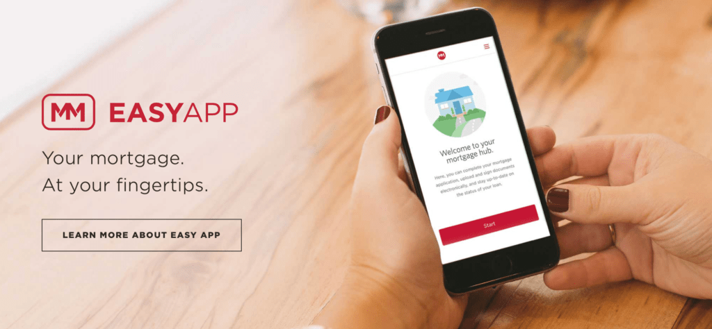
The call to action is breathtakingly concise. “Your mortgage. At your fingertips. Learn more about Easy App.” They could have had a million bullet points listing “Pay your mortgage on the go. Check your interest rates. Never miss a payment. Highly secure.”
It’s a hard balance to strike: you have to give customers enough information to get them to click, but not so much that it overwhelms. When in doubt, ask a copywriter or marketer for a second opinion.
CTA Buttons: Why They Matter & How to Use Them
You can– and should– use CTAs on all types of marketing materials and on every platform you’re marketing on. This includes PPC ads of course, but it also includes landing pages, websites, blogs, newsletters, emails, and more. Sometimes, this means that you just need to stick to a plain-text CTA that’s possibly hyperlinked.
In plenty of cases, though, there’s a good chance that you would benefit significantly from clickable CTA buttons.
That’s why even Facebook has short, clickable CTA buttons that you can add to every ad campaign, and why you’ll see so many landing pages with bright “Sign Up Now!” text in a big yellow button. Clickable CTA buttons specifically have been proven many times over to increase conversion rates significantly. One study found that adding a CTA button to their article templates increased conversions by 83%, and it boosted ecommerce conversions by 22%. Copyblogger found something similar; when their CTAs looked like buttons instead of plain text, they saw a conversion rate increase of 45%.
Let’s take a look at a few best practices for CTA buttons and how to use them in ads and on your site (including site pages, landing pages, and even your blog.
Facebook Ads
You know we had to start with Facebook Ads!
For a few years now, Facebook has had clickable CTA buttons built into the native interface. Button options include “Shop Now,” “Learn More,” “Download,” “Send Message,” and more. The idea is that you can use these CTA buttons to reinforce your ads, increasing the likelihood of conversion.

You should absolutely always include a CTA button on your ad campaigns in addition to using a CTA in the headline and/or description copy, too. Users intuitively are more likely to click when they see that button prompting them to take action without even realizing it.
Remember to tailor your CTA based on the ad that you’re running and the stage of the funnel that you’re targeting. Opting for “learn more” for users earlier in the funnel can feel lower-risk and less pressure than starting with a “Shop Now,” but this depends on the ad and the audience.
And if you’re wondering if these CTAs matter, know that they most definitely do. AdEspresso recently ran a $1000 experiment testing different types of CTA buttons on Facebook Ads to see what was most successful. They found that for an ad trying to drive downloads of a lead magnet, “learn more” was the second most successful, closely following by “download.” “Sign up” was the least successful, and we theorized that it was because audience members had a connotation of “sign up” that meant they’d need to enter in their credit card or that there would be some other catch.
The simple act of deciding not to use a CTA button can actually cost you 2.5x more per lead than if you were to choose a relevant CTA, so keep that in mind.
We recommend testing out different CTA buttons using Facebook’s split testing feature (or our native split testing feature with AdEspresso!) to see what your audience responds to. Remember to take a look at what drives the most conversions and how much each one costs per action; both are important parts of the puzzle.
Your Website & Landing Pages
It’s always a good idea to use clickable CTA buttons to help users navigate through your site and to take certain actions. This is important both for your general website and your landing pages, too.
You can use these buttons to prioritize certain actions or to take users through typical paths that users follow when they’re most likely to convert. (On my site, for example, Google Analytics has shown that people who visit my portfolio page first are 6x more likely to get in touch with me than those who just view my contact page first.)
On landing pages and the home page of your website, you’ll want to make sure that the CTA button meets the following criteria:
- It uses contrasting colors to jump out at the user.
- It’s clearly a clickable button designed to improve navigation.
- It utilizes brief copy on the button itself but is often surrounded by copy that adds context and makes it more persuasive (like the example above).
- It should appear above the fold on the page, meaning that users can see at least one CTA button before they’d need to scroll down to see more information on the page. Make sure you take this into account on both desktop and mobile sites.
When you’re creating landing pages and site pages, remember to test them. Most people don’t realize that you can test site pages just like you would PPC campaigns when you’re using tools like Unbounce. Test different types of CTA copy, different placements, or even different colored buttons. Look for what works best, and optimize your pages accordingly. You can learn more about how to do this by checking out our $1000 case study here.
Final Thoughts
These call to action examples show that having a strong, intentional, well-crafted CTA can breathe new life into your campaigns. Not having one could sink even the best content.
It’s also important to remember that CTAs shouldn’t just be kept to a PPC campaign or an email blast; they should be used in as many types of marketing content as possible.
Your blog post can encourage people to leave comments, or to subscribe to the newsletter, or try a new product; your Instagram post can encourage users to “check the link in our bio for more!”
A lot of businesses underuse CTAs, so take a look at your content and see where you should make an effort to incorporate them more often.
Just take note of the call to action examples in this guide and follow the steps to writing the perfect call to action and watch the positive impact on your business.
What do you think are the best call to action examples? Which brands used them well? How do you write the perfect call to action for your campaigns? Don’t forget to share your thoughts in the comments below!